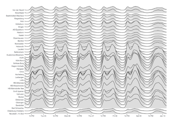
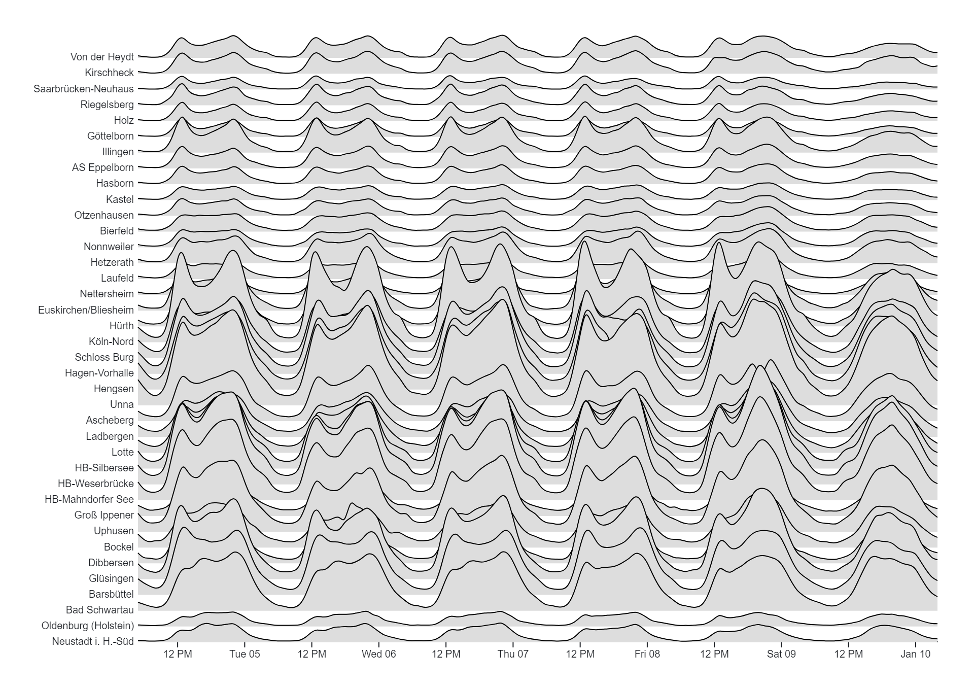
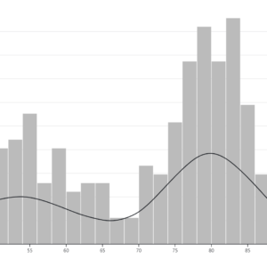
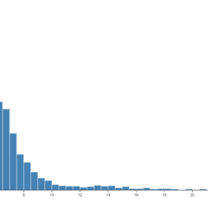
Ridgeline Plot charts, also known as joyplot or ridge plot charts, are a data visualization technique used to depict the distribution of a numeric variable across different categories or groups. In a Ridgeline Plot chart, multiple density plots are stacked vertically, with each plot representing the distribution of the numeric variable for a specific category or group. The density plots are smoothed to provide a continuous representation of the distribution, and they are typically overlaid with semi-transparent colors to distinguish between the different categories. The resulting visualization resembles a series of ridges or hills, hence the name “Ridgeline Plot.” Ridgeline Plot charts are particularly useful for visualizing changes in distributions or comparing distributions between different groups. They enable users to identify patterns, trends, or differences in the distribution of the variable across categories, facilitating insights into the data. Ridgeline Plot charts are commonly used in fields such as data analysis, statistics, and data visualization, where understanding the distribution of variables is essential for analysis and interpretation. They offer a visually appealing and informative way to explore and communicate data distributions in a compact and efficient format.
Uses:
- Comparing Distributions: Ridgeline Plot charts are used to compare the distributions of a numeric variable across different categories or groups.
- Identifying Patterns: They help identify patterns or trends in the distribution of the variable, such as peaks, valleys, or shifts, across categories.
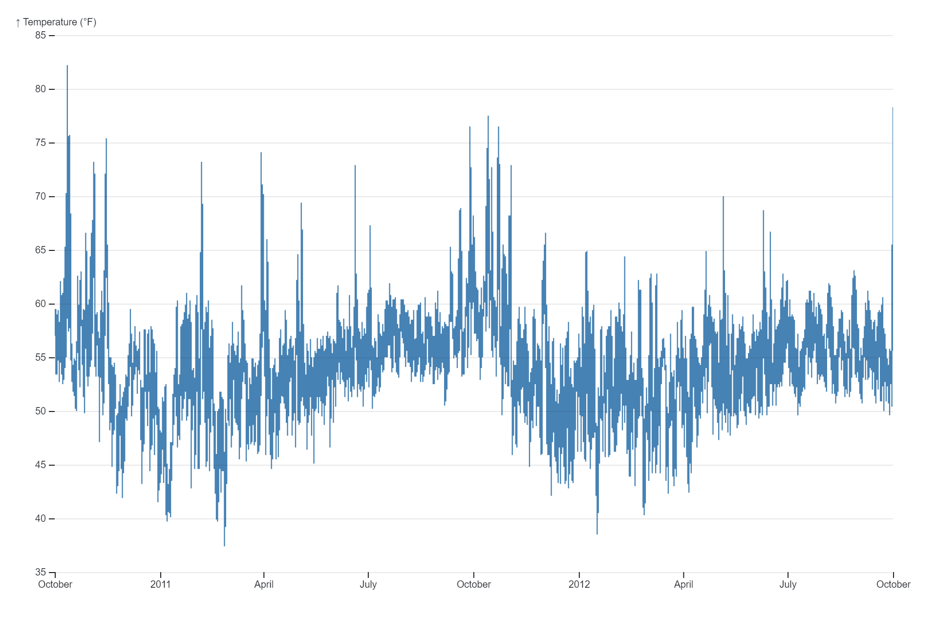
- Visualizing Trends Over Time: Ridgeline Plot charts can be used to visualize changes in the distribution of a variable over time, providing insights into temporal trends.
- Analyzing Survey Responses: They assist in analyzing survey data by visualizing the distribution of responses to different survey questions across demographic groups.
- Exploring Multivariate Relationships: Ridgeline Plot charts help explore multivariate relationships by visualizing the joint distribution of multiple variables across categories.
- Monitoring Performance Metrics: They aid in monitoring performance metrics or key performance indicators (KPIs) across different departments, regions, or time periods.
- Assessing Customer Segments: Ridgeline Plot charts are useful for assessing customer segments by visualizing differences in behavior or preferences across segments.
- Comparing Product Features: They assist in comparing product features or attributes by visualizing differences in ratings or evaluations across product categories.
- Understanding Market Trends: Ridgeline Plot charts help understand market trends by visualizing changes in sales or market share across different product categories or brands.
- Investigating Demographic Differences: They are used to investigate demographic differences by visualizing variations in the distribution of a variable across age groups, genders, or other demographic categories.
Purposes:
- Distribution Visualization: The primary purpose of Ridgeline Plot charts is to visualize the distribution of a numeric variable across categories or groups.
- Pattern Identification: They aid in identifying patterns, trends, or anomalies in the distribution of the variable across categories.
- Comparison: Ridgeline Plot charts facilitate comparison of distributions between different categories or groups, allowing for insights into differences or similarities.
- Insights Generation: They support insights generation by providing a visual representation of data distributions, helping users understand underlying patterns or trends.
- Communication: Ridgeline Plot charts serve as a communication tool for presenting complex distributional data in a visually intuitive format, making it easier for stakeholders to understand and interpret.
- Exploratory Data Analysis: They assist in exploratory data analysis by enabling users to explore and understand the distributional properties of the data across different dimensions or categories.
- Hypothesis Testing: Ridgeline Plot charts are used in hypothesis testing by visually examining differences in distributions between groups or conditions.
- Data-driven Decision Making: They support data-driven decision-making processes by providing insights into the distributional characteristics of the data, helping inform strategic decisions.
- Data Storytelling: Ridgeline Plot charts are employed in data storytelling to convey narratives or insights about the distributional properties of the data to a broader audience.
- Statistical Inference: They are used in statistical inference to visually assess assumptions or distributions underlying statistical models or analyses.
Reviews
There are no reviews yet.