Sale!

Scatterplot with shapes

Original price was: $ 15.Current price is: $ 10.

Description

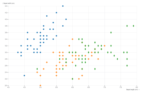
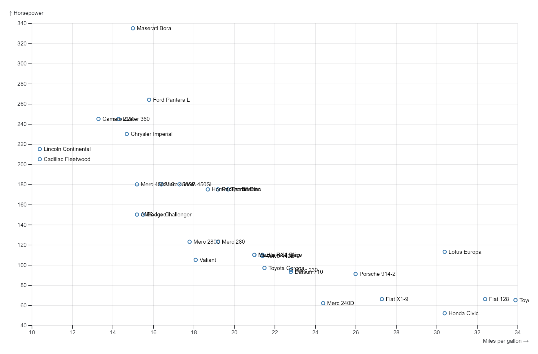
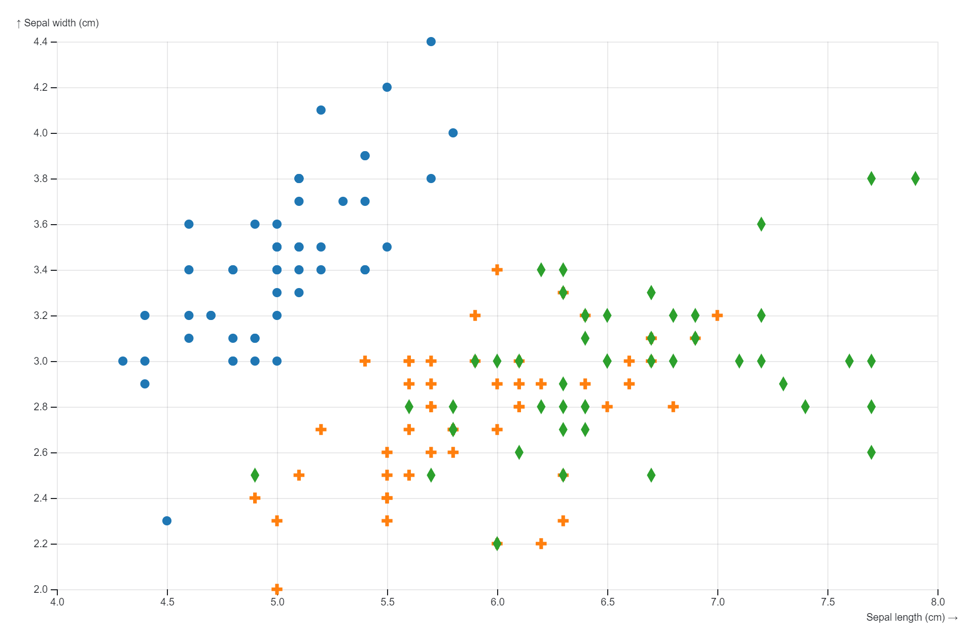
A scatterplot with shapes represents data points using distinct symbols instead of dots, with each shape denoting a specific category or group within the dataset. By incorporating categorical information into the visualization, it allows for the exploration of multivariate relationships and the identification of patterns or trends across different groups. This type of plot is commonly utilized in data analysis to discern relationships between variables while considering categorical distinctions.

Purposes :

Scatterplots with shapes serve several purposes in data visualization:

  1. Differentiating Data Groups: Using different shapes for data points in a scatterplot allows for the clear differentiation of multiple groups or categories within the dataset. This aids in visually distinguishing between different data subsets, facilitating comparison and analysis.
  2. Encoding Additional Information: By associating specific shapes with different categories or variables, scatterplots with shapes can encode additional information beyond just the position of data points. This can include grouping by class, category, or any other relevant attribute.
  3. Highlighting Patterns: Shapes can be used to highlight specific patterns or relationships within the data. For example, different shapes can represent different experimental conditions or treatments, making it easier to identify any trends or differences across the groups.
  4. Enhancing Readability: Scatterplots with shapes can enhance readability and clarity, especially when dealing with complex datasets or large numbers of data points. The use of shapes helps to reduce clutter and improve the overall legibility of the visualization.
  5. Adding Context: Shapes can add context to the data points by providing additional visual cues or meaning. For example, specific shapes might represent different geographic regions, allowing viewers to quickly understand the spatial distribution of the data.
  6. Supporting Multivariate Analysis: By combining shapes with other visual encoding techniques such as color or size, scatterplots can effectively represent multiple variables simultaneously. This supports multivariate analysis and allows for deeper exploration of the data.
  7. Facilitating Group Comparison: Scatterplots with shapes make it easy to compare multiple groups or categories within the same visualization. Viewers can quickly identify similarities or differences between groups based on the shape of the data points.
  8. Increasing Interpretability: Shapes can make the scatterplot more interpretable by providing intuitive visual cues that help viewers understand the underlying structure of the data. This can aid in drawing meaningful conclusions and insights from the visualization.
  9. Improving Accessibility: Using shapes in scatterplots can improve accessibility for colorblind viewers or those with visual impairments. Shapes provide an alternative means of conveying information, ensuring that the visualization remains accessible to a wider audience.
  10. Enhancing Aesthetics: Finally, scatterplots with shapes can enhance the aesthetic appeal of the visualization, making it more engaging and visually appealing. Well-designed shapes can add visual interest and make the plot more visually appealing without sacrificing clarity or readability.

Uses :

Scatterplots with shapes are widely used in data visualization for various purposes, including:

  1. Differentiating Data Groups: Shapes in scatterplots allow for the clear differentiation of multiple groups or categories within the dataset. This aids in visually distinguishing between different data subsets, facilitating comparison and analysis.
  2. Visualizing Multivariate Data: By combining shapes with other visual encoding techniques such as color or size, scatterplots can effectively represent multiple variables simultaneously, supporting multivariate analysis and allowing for deeper exploration of the data.
  3. Highlighting Patterns and Relationships: Shapes can be used to highlight specific patterns or relationships within the data. For example, different shapes might represent different experimental conditions or treatments, making it easier to identify any trends or differences across the groups.
  4. Encoding Additional Information: Shapes can encode additional information beyond just the position of data points. This can include grouping by class, category, or any other relevant attribute, providing viewers with more context and insight into the data.
  5. Enhancing Readability: Scatterplots with shapes can enhance readability and clarity, especially when dealing with complex datasets or large numbers of data points. The use of shapes helps to reduce clutter and improve the overall legibility of the visualization.
  6. Facilitating Group Comparison: Shapes make it easy to compare multiple groups or categories within the same visualization. Viewers can quickly identify similarities or differences between groups based on the shape of the data points, aiding in comparative analysis.
  7. Adding Context: Shapes can add context to the data points by providing additional visual cues or meaning. For example, specific shapes might represent different geographic regions, allowing viewers to quickly understand the spatial distribution of the data.
  8. Improving Accessibility: Using shapes in scatterplots can improve accessibility for colorblind viewers or those with visual impairments. Shapes provide an alternative means of conveying information, ensuring that the visualization remains accessible to a wider audience.
  9. Supporting Exploratory Data Analysis: Scatterplots with shapes are valuable for exploratory data analysis, allowing users to visually explore relationships, patterns, and trends within the data. They enable users to interactively investigate the dataset and generate hypotheses for further investigation.
  10. Communicating Insights: Ultimately, scatterplots with shapes serve as effective communication tools for presenting insights from data analysis to stakeholders or audiences in a clear, concise, and visually appealing manner. They help convey complex information in a comprehensible and engaging format, facilitating understanding and interpretation of the data.

Reviews

There are no reviews yet.

Only logged in customers who have purchased this product may leave a review.