Sale!

Beeswarm

Original price was: $ 15.Current price is: $ 10.

Description

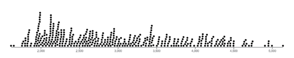
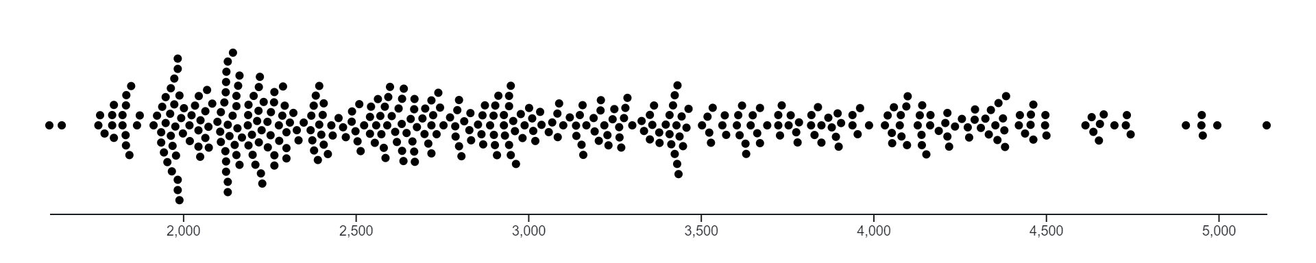
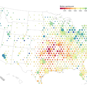
A beeswarm chart, also known as a beeswarm plot or dot plot, is a type of data visualization that displays individual data points along a single axis while minimizing overlap.

Beeswarm charts are particularly useful for visualizing distributions of small to moderate-sized datasets and for identifying patterns, trends, or outliers within the data. They are commonly used in various fields such as statistics, biology, and data analysis for their simplicity and effectiveness in displaying individual data points.

Purpose :

The purpose of beeswarm charts includes:

  1. Visualizing Distribution: Beeswarm charts provide a clear visualization of the distribution of data points along a single axis, making it easy to observe patterns, trends, and outliers within the data.
  2. Preventing Overplotting: By arranging data points in a clustered manner without overlapping, beeswarm charts prevent overplotting, ensuring that each data point remains distinct and visible.
  3. Comparing Groups: Beeswarm charts facilitate the comparison of distributions between different groups or categories of data, enabling users to visually assess differences or similarities in the data.
  4. Identifying Outliers: They help in identifying outliers or extreme values within a dataset by visually highlighting data points that are far from the central tendency of the distribution.
  5. Exploring Relationships: Beeswarm charts enable the exploration of relationships between variables by clustering data points according to different categories or groups, allowing users to assess how distributions vary across these categories.
  6. Maintaining Data Integrity: By preventing overlap between data points, beeswarm charts ensure that all data points remain visible and maintain their individual identity, even in dense areas of the chart.
  7. Supporting Statistical Analysis: They serve as a visual aid for statistical analysis, allowing analysts to visually inspect data distributions, assess data quality, and make informed decisions about appropriate statistical tests or modeling techniques.
  8. Communicating Insights: Beeswarm charts are effective communication tools for presenting insights from data analysis to stakeholders or audiences in a clear, concise, and visually appealing manner.
  9. Enhancing Data Exploration: They facilitate data exploration by providing a structured visualization of data distributions, allowing users to interactively explore the data, identify interesting patterns or outliers, and gain deeper insights into the underlying data distribution.
  10. Providing Context: Beeswarm charts offer context to numerical data by representing it in a visual form, making it easier for users to understand and interpret the data in relation to its distribution.

Uses :

Here are some common uses of beeswarm charts:

  1. Visualizing Distribution: Beeswarm charts provide a visual representation of the distribution of data points along a single axis, making it easy to observe patterns, trends, and outliers within the data.
  2. Comparing Groups: They facilitate the comparison of distributions between different groups or categories of data, allowing users to visually assess differences or similarities in the data.
  3. Identifying Outliers: Beeswarm charts help in identifying outliers or extreme values within a dataset by visually highlighting data points that are far from the central tendency of the distribution.
  4. Exploring Relationships: They enable the exploration of relationships between variables by clustering data points according to different categories or groups, allowing users to assess how distributions vary across these categories.
  5. Preventing Overplotting: By arranging data points in a clustered manner without overlapping, beeswarm charts prevent overplotting, ensuring that each data point remains distinct and visible.
  6. Maintaining Data Integrity: Beeswarm charts ensure that all data points remain visible and maintain their individual identity, even in dense areas of the chart, by preventing overlap between data points.
  7. Statistical Analysis: They serve as a visual aid for statistical analysis, allowing analysts to visually inspect data distributions, assess data quality, and make informed decisions about appropriate statistical tests or modeling techniques.
  8. Communicating Insights: Beeswarm charts are effective communication tools for presenting insights from data analysis to stakeholders or audiences in a clear, concise, and visually appealing manner.
  9. Enhancing Data Exploration: They facilitate data exploration by providing a structured visualization of data distributions, allowing users to interactively explore the data, identify interesting patterns or outliers, and gain deeper insights into the underlying data distribution.
  10. Providing Context: Beeswarm charts offer context to numerical data by representing it in a visual form, making it easier for users to understand and interpret the data in relation to its distribution.

Reviews

There are no reviews yet.

Only logged in customers who have purchased this product may leave a review.