Sale!
Only logged in customers who have purchased this product may leave a review.
Related products
-
- Sale!
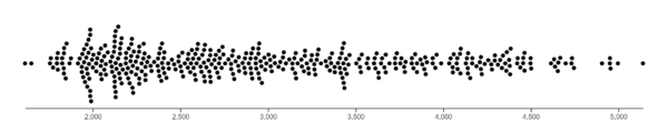
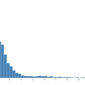
Histogram
- Original price was: $ 15.$ 10Current price is: $ 10.
- Add to cart
-
- Sale!
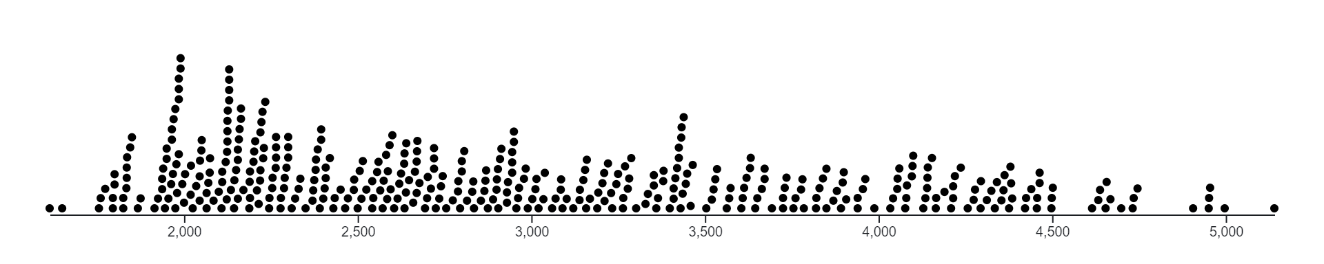
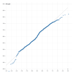
Normal Quantile Plot
- Original price was: $ 15.$ 10Current price is: $ 10.
- Add to cart
-
- Sale!
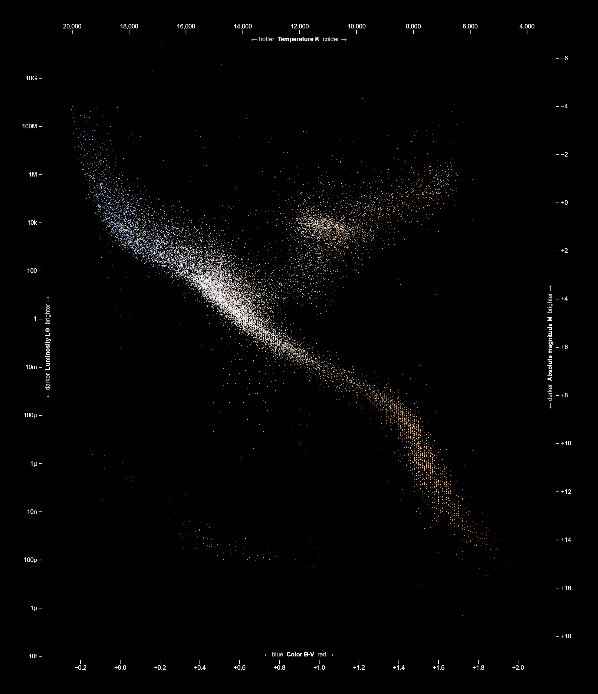
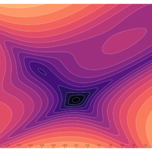
Contours
- Original price was: $ 15.$ 10Current price is: $ 10.
- Add to cart
Reviews
There are no reviews yet.