Horizontal bar charts serve several important purposes in data visualization:
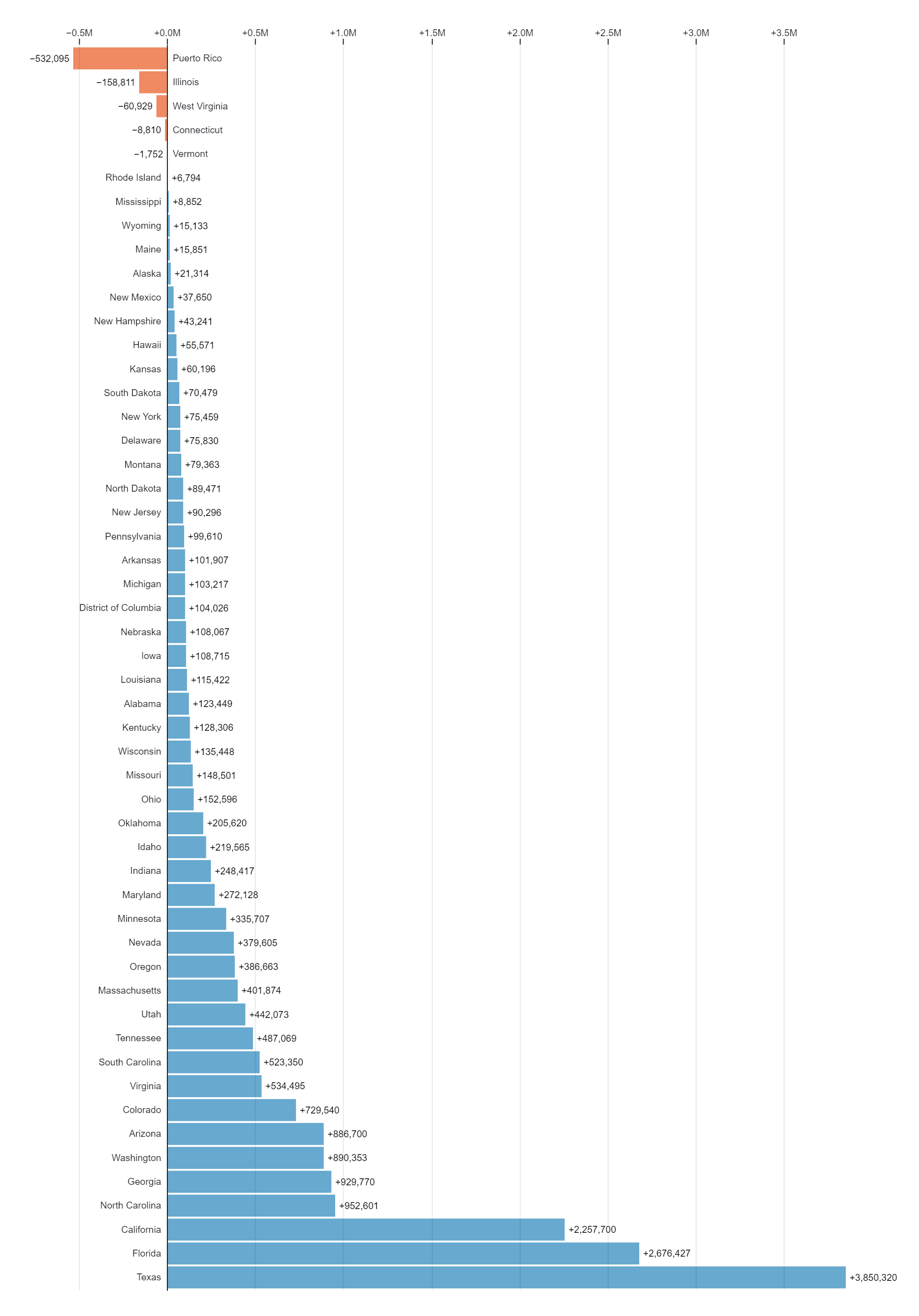
- Comparing Categories: Horizontal bar charts are effective for comparing the values of different categories or groups. They allow viewers to easily see the relative sizes of the bars, making it straightforward to identify the largest or smallest categories.
- Ranking: Horizontal bar charts can be used to rank categories based on their values. This is useful for identifying the top performers, highest-selling products, most populous cities, or any other ranked data.
- Space Efficiency: In certain cases, horizontal bar charts can be more space-efficient than vertical bar charts, particularly when labels for the categories are lengthy or when there are many categories to display.
- Long Labels: Horizontal bar charts are well-suited for displaying long category labels because they provide more horizontal space for text without causing label overlap or clutter.
- Timeline Visualization: In horizontal bar charts where categories represent time periods, such as years or months, viewers can easily see the progression of time from left to right. This makes horizontal bar charts suitable for visualizing timelines and time-series data.
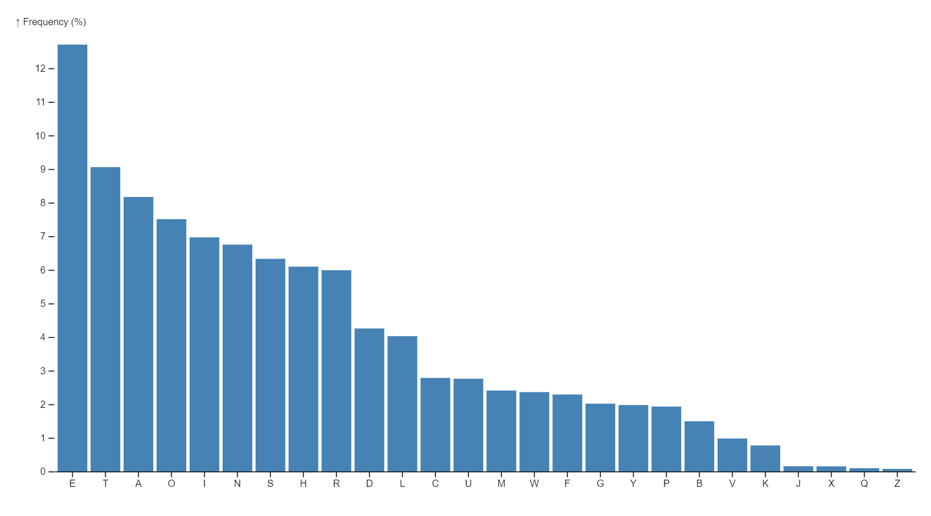
- Data Distribution: Horizontal bar charts can effectively display the distribution of data within categories. They can show the frequency distribution of responses to a survey question, the distribution of age groups in a population, or the distribution of product defects by type.
- Part-to-Whole Comparison: Horizontal bar charts can illustrate the composition of a whole by showing the parts that make it up. For example, they can display the distribution of expenses in a budget, the market share of different companies, or the contribution of each department to overall revenue.
Overall, horizontal bar charts are a versatile tool in data visualization, offering a clear and intuitive way to compare categories, rank data, visualize distributions, and display part-to-whole relationships.
Uses :


Reviews
There are no reviews yet.