Sale!

Diverging bar chart

Original price was: $ 15.Current price is: $ 10.

Description

A diverging bar chart is a graphical representation of data that uses horizontal bars to display values, with a central axis representing a neutral or zero point. The bars extend to the left and right of this axis, with values above the axis represented by bars extending to the right and values below the axis represented by bars extending to the left. Diverging bar charts are commonly used to visually compare positive and negative values relative to a central reference point, highlighting differences and trends in the data.

Purposes :

Diverging bar charts serve several important purposes in data visualization:

  1. Highlighting Differences: Diverging bar charts are effective for highlighting differences between positive and negative values relative to a central reference point. By visually displaying values on both sides of the central axis, they make it easy to compare the magnitude and direction of deviations from the reference point.
  2. Visualizing Relationships: These charts help visualize the relationships between opposing values or categories. They are particularly useful for comparing the performance of two groups, the effectiveness of two interventions, or the positive and negative impacts of a particular variable.
  3. Identifying Trends: Diverging bar charts enable users to identify trends or patterns in data by visually comparing the lengths and directions of the bars. This helps in identifying which values are increasing or decreasing relative to the central reference point.
  4. Communicating Balance: Diverging bar charts effectively communicate the balance between opposing forces or factors. They provide a clear visual representation of the equilibrium or imbalance between positive and negative values, helping viewers understand the overall distribution of data.
  5. Highlighting Outliers: Diverging bar charts can help identify outliers or extreme values that deviate significantly from the central reference point. These outliers are visually apparent as bars that extend far to the left or right of the central axis, indicating unusual or exceptional data points.
  6. Comparing Scenarios: Diverging bar charts are useful for comparing different scenarios or scenarios over time. By visually displaying the differences between positive and negative values, they allow users to assess the impact of changes or interventions on various outcomes.

 Uses :

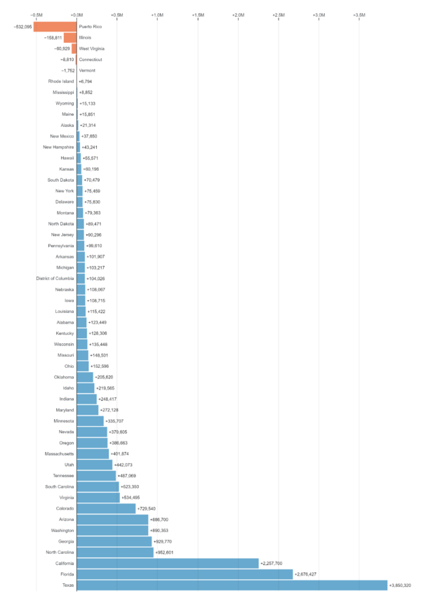
Diverging bar charts have several key uses in data visualization:

  1. Comparing Positive and Negative Values: Diverging bar charts are effective for visually comparing positive and negative values relative to a central reference point. They allow users to easily assess the magnitude and direction of differences between opposing values.
  2. Highlighting Deviations from a Norm: These charts are useful for highlighting deviations from a central reference point or baseline. They help identify values that are significantly above or below the reference point, indicating outliers or areas of interest.
  3. Visualizing Balance or Imbalance: Diverging bar charts communicate the balance or imbalance between opposing factors or categories. They provide a clear visual representation of the distribution of positive and negative values, aiding in understanding the overall pattern or trend.
  4. Analyzing Impact: Diverging bar charts are valuable for analyzing the impact of interventions, changes, or factors on different outcomes. By comparing positive and negative values before and after an intervention, users can assess its effectiveness or influence on the data.
  5. Comparing Groups or Scenarios: These charts facilitate comparisons between different groups, scenarios, or time periods. They help users understand how various factors or groups contribute to overall outcomes and identify patterns or trends across different categories.
  6. Identifying Trends and Patterns: Diverging bar charts assist in identifying trends, patterns, or shifts in the data by visually comparing the lengths and directions of the bars. Users can easily spot changes over time or differences between groups.
  7. Communicating Insights: Diverging bar charts provide a visually engaging way to communicate insights and findings to stakeholders or audiences. They help convey complex information in a clear and intuitive manner, making it easier for others to understand and interpret the data.


Reviews

There are no reviews yet.

Only logged in customers who have purchased this product may leave a review.