Sale!

Stacked horizontal Bar chart

Original price was: $ 15.Current price is: $ 10.

Description

A stacked horizontal bar chart is a graphical representation of data that displays multiple data series using horizontal bars. Each bar is divided into segments or layers representing different categories or subgroups, stacked horizontally from left to right. The length of each segment corresponds to the value it represents, and the total length of the bar represents the total value of the data series. Stacked horizontal bar charts are useful for comparing the total and relative contributions of different categories to the overall total across multiple data series.

Purposes :

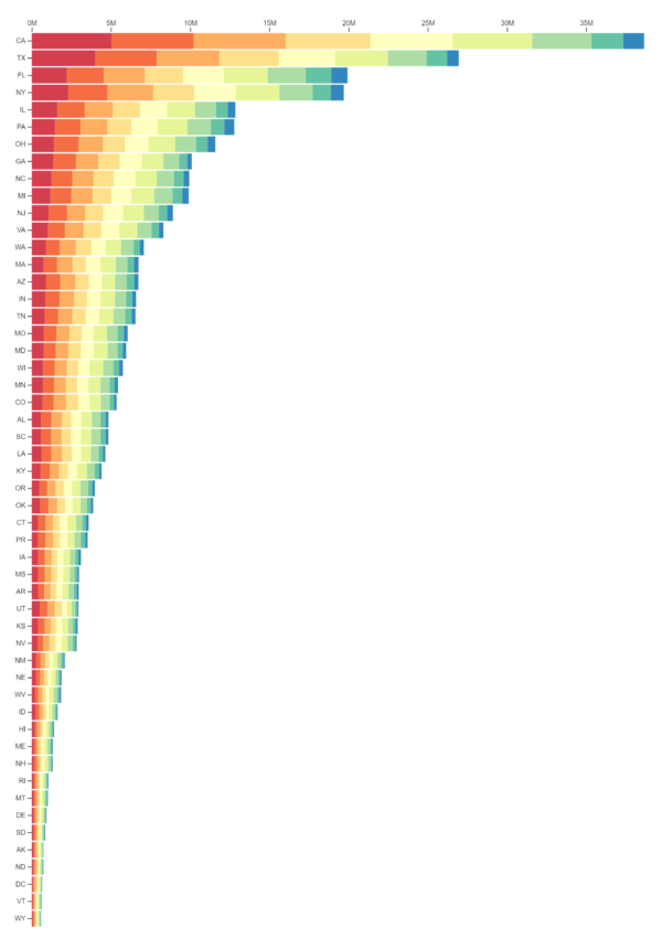
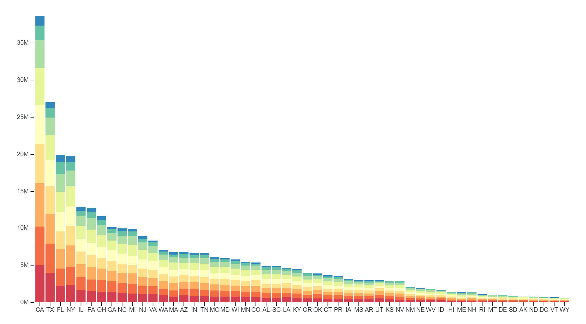
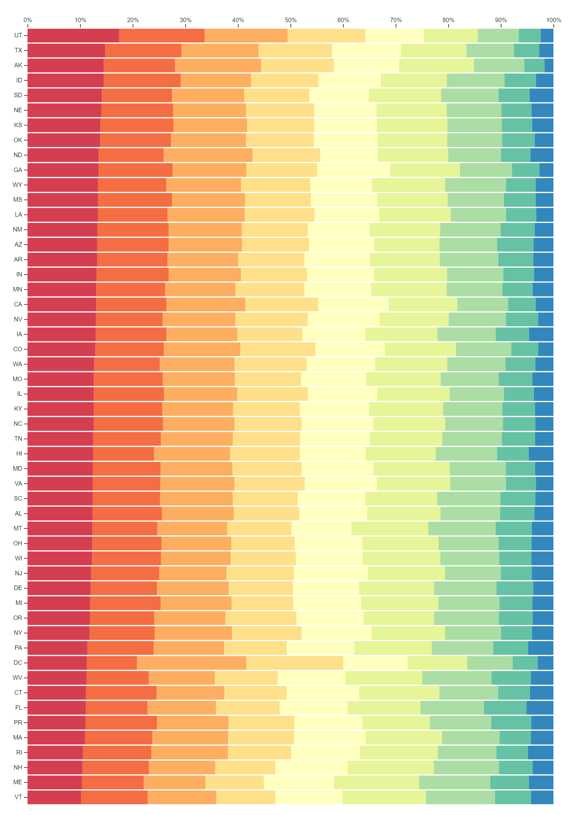
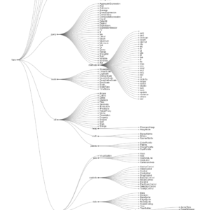
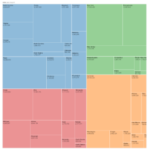
Stacked horizontal bar charts serve several important purposes in data visualization:

  1. Comparing Total Values: Stacked horizontal bar charts allow viewers to compare the total values of multiple data series. By stacking segments of bars horizontally, the total length of each bar represents the combined total of all data series, facilitating easy comparison of overall quantities.
  2. Analyzing Composition: These charts help analyze the composition of each data series by showing the relative contributions of different categories or subgroups. Each segment within a bar represents a category, and its length indicates the proportion of the total value contributed by that category.
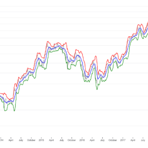
  3. Visualizing Trends Over Time: Stacked horizontal bar charts can be used to visualize trends over time for multiple categories or subgroups. By stacking bars representing different time periods horizontally, viewers can observe changes in the composition of data series over time and identify shifting trends.
  4. Highlighting Patterns: Stacked horizontal bar charts highlight patterns and relationships between different categories within data series. They make it easy to see which categories contribute the most to the total value and identify any significant variations or outliers.
  5. Comparing Distribution: Stacked horizontal bar charts facilitate comparison of the distribution of values across different categories or subgroups within each data series. Viewers can visually compare the proportions of each category across multiple bars to understand how distributions vary between different datasets.
  6. Communicating Complex Data: Stacked horizontal bar charts provide a concise and visually appealing way to communicate complex data relationships. They help convey information about the composition and distribution of multiple data series in a clear and intuitive manner.
  7. Supporting Decision-Making: Stacked horizontal bar charts assist in decision-making by providing insights into the relative importance of different categories within data series. Decision-makers can use the information presented in the charts to identify areas of focus or prioritize actions based on the contributions of various categories.

Overall, stacked horizontal bar charts are a versatile tool in data visualization, suitable for analyzing composition, comparing total values, visualizing trends, highlighting patterns, and communicating complex data relationships.

Uses :

Stacked horizontal bar charts have various uses in data visualization:

  1. Comparing Total Values: Stacked horizontal bar charts allow for easy comparison of total values across multiple categories or groups. Users can quickly assess which categories contribute the most or least to the overall total, aiding in decision-making and prioritization.
  2. Analyzing Composition: These charts help in analyzing the composition of data sets by showing the relative contributions of different categories or subgroups. Each segment within a bar represents a category, and its length indicates the proportion of the total value contributed by that category.
  3. Visualizing Trends Over Time: When used to represent time-series data, stacked horizontal bar charts can show how the composition of data changes over time. This helps in identifying trends, patterns, and shifts in the distribution of values.
  4. Highlighting Patterns and Relationships: Stacked horizontal bar charts help highlight patterns and relationships between different categories within data sets. They make it easy to compare the distribution of values across categories, revealing insights into the data structure.
  5. Comparing Distribution: Stacked horizontal bar charts facilitate comparisons of the distribution of values across different categories or subgroups within each data series. Viewers can assess how the proportions of each category vary across multiple data sets.
  6. Communicating Complex Data: Stacked horizontal bar charts provide a concise and intuitive way to communicate complex data relationships. They simplify the presentation of information about the composition and distribution of data sets, making it easier for viewers to understand.
  7. Decision Support: Stacked horizontal bar charts assist in decision-making by providing insights into the relative importance of different categories within data sets. Decision-makers can use the information presented in the charts to prioritize actions or allocate resources effectively.

Overall, stacked horizontal bar charts are a versatile visualization tool that can be used to analyze composition, compare values, visualize trends, highlight patterns, and support decision-making across various domains.

Reviews

There are no reviews yet.

Only logged in customers who have purchased this product may leave a review.