Description
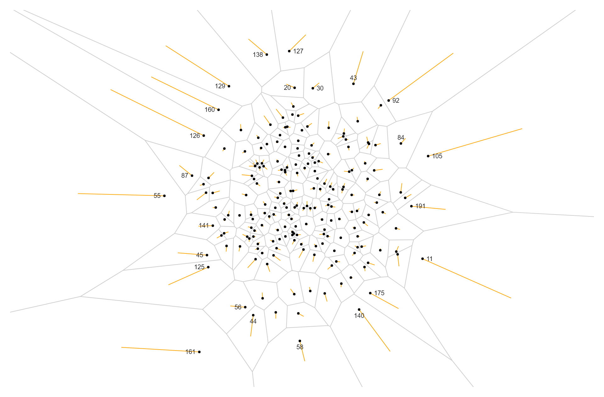
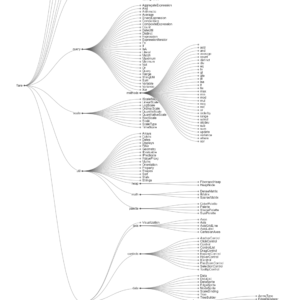
An occlusion chart is a type of data visualization that displays information by revealing or occluding elements based on their relevance or priority. In an occlusion chart, data points or elements are arranged in layers, with each layer representing a different level of importance or significance. The chart dynamically reveals or hides these layers based on user interactions or predefined criteria, allowing viewers to focus on the most relevant information while gradually revealing additional details as needed. Occlusion charts are particularly useful for visualizing complex datasets or hierarchical structures, as they provide a structured way to navigate and explore the data. By selectively revealing information, occlusion charts help users maintain focus and clarity while exploring the data, making it easier to identify patterns, trends, and relationships. Additionally, occlusion charts can be interactive, allowing users to customize the display based on their preferences or specific analysis goals. Overall, occlusion charts offer a flexible and intuitive approach to data visualization, enabling users to efficiently explore and understand complex datasets in a visual and interactive manner.
Uses:
- Hierarchical Data Visualization: Occlusion charts are commonly used to visualize hierarchical data structures, such as organizational charts, family trees, or network diagrams.
- Multi-layered Information Display: They are useful for displaying multi-layered information, where different layers represent different levels of detail or importance.
- Interactive Data Exploration: Occlusion charts facilitate interactive data exploration, allowing users to selectively reveal or hide layers of information based on their preferences or analysis goals.
- Focus and Context Visualization: They help users maintain focus on specific elements or regions of interest while providing context by revealing additional information as needed.
- Comparative Analysis: Occlusion charts support comparative analysis by allowing users to compare different layers or levels of information side by side.
- Temporal Data Visualization: They are effective for visualizing temporal data, where layers represent different time periods or intervals.
- Spatial Data Representation: Occlusion charts can be used to represent spatial data, such as maps or floor plans, where layers correspond to different geographic features or levels.
- Task Management: They aid in task management by visualizing task hierarchies or project structures, helping users prioritize and organize their workflow.
- Decision Support: Occlusion charts support decision-making processes by providing a structured and intuitive way to explore complex datasets and identify key insights.
- Educational Tool: They serve as educational tools for teaching data visualization concepts and techniques, allowing students to interactively explore and understand complex datasets.
Purposes:
- Data Simplification: The purpose of occlusion charts is to simplify complex datasets by selectively revealing or hiding layers of information, making it easier for users to understand and interpret the data.
- Focus Management: They help manage focus by allowing users to focus on specific elements or regions of interest while providing context through selectively revealed layers.
- Interactive Exploration: Occlusion charts support interactive data exploration by allowing users to interactively navigate and explore different layers of information.
- Contextual Understanding: They aid in contextual understanding by providing users with contextually relevant information based on their interactions with the chart.
- Decision Support: Occlusion charts support decision-making processes by providing users with insights and information relevant to their decision-making needs.
- Efficient Data Analysis: They facilitate efficient data analysis by providing a structured and intuitive way to explore and analyze complex datasets.
- Customization: Occlusion charts allow users to customize the display based on their preferences or specific analysis goals, providing a tailored experience for different users or use cases.
- Pattern Recognition: They support pattern recognition by allowing users to compare and contrast different layers of information, helping identify patterns, trends, and relationships within the data.
- Collaboration: Occlusion charts facilitate collaboration by providing a shared visual environment where users can interactively explore and discuss complex datasets.
- Insights Generation: They aid in generating insights and hypotheses about the data by allowing users to interactively explore different layers and aspects of the dataset.
Only logged in customers who have purchased this product may leave a review.
Related products
-
- Sale!
Volcano Contours
- Original price was: $ 15.$ 10Current price is: $ 10.
- Add to cart
-
- Sale!
Tidy Tree
- Original price was: $ 15.$ 10Current price is: $ 10.
- Add to cart
-
- Sale!
Nested Tree Map
- Original price was: $ 15.$ 10Current price is: $ 10.
- Add to cart
Reviews
There are no reviews yet.