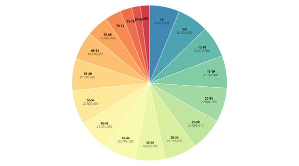
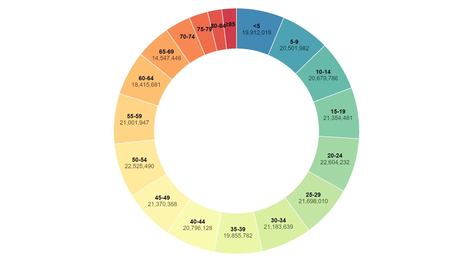
A donut chart is a circular data visualization that resembles a pie chart with a hole in the center. It displays categorical data as slices of a circle, where each slice represents a category and the size of the slice corresponds to the proportion of that category relative to the whole. The hole in the center of the chart allows for additional information or labels to be displayed, making it a space-efficient way to convey data and compare the relative sizes of categories.
Purpose :
The purposes of a pie chart include:
Visualizing Proportions: Pie charts are used to visually represent the proportions of different categories within a dataset. Each slice of the pie represents a category, and the size of the slice corresponds to the proportion of that category relative to the whole. This allows viewers to quickly grasp the distribution of data.
Comparing Categories: Pie charts facilitate comparison between categories by displaying them side by side. Users can easily compare the sizes of the slices and identify which categories are relatively larger or smaller in the dataset.
Highlighting Differences: Pie charts help in highlighting differences in the distribution of data across categories. Users can quickly identify categories that stand out or have significantly different proportions compared to others.
Showing Part-to-Whole Relationships: Pie charts effectively illustrate part-to-whole relationships within a dataset. The entire pie represents the whole dataset, while each slice represents a part or category. This makes it easy to see how each category contributes to the overall dataset.
Enhancing Data Presentation: Pie charts are visually appealing and can enhance the presentation of data in reports, presentations, and dashboards. Their circular layout and clear visualization of proportions make them an effective tool for communicating insights to stakeholders.
Overall, the purpose of a pie chart is to provide a visually intuitive way to represent proportions, compare categories, highlight differences, show part-to-whole relationships, and enhance the presentation of data in various domains and applications.
Uses :
Suitable uses of a pie chart include:
Market Share Analysis: Pie charts are commonly used to visualize market share data, where each slice represents the proportion of sales or revenue generated by different competitors or products in a market. This allows stakeholders to quickly understand the market landscape and identify key players.
Budget Allocation: Pie charts are useful for visualizing budget allocation across different expense categories, such as housing, transportation, food, and entertainment. Each slice represents the proportion of the budget allocated to a specific category, helping individuals or organizations manage their finances effectively.
Survey Results: Pie charts are effective for presenting the results of surveys or polls, where each slice represents the percentage of respondents selecting a particular option. This provides a visual summary of survey responses and allows viewers to see the distribution of opinions or preferences.
Sales Analysis: Pie charts can be used to analyze sales performance across different product categories or regions. Each slice represents the proportion of sales generated by a specific product category or in a particular region, allowing stakeholders to identify top performers and areas for improvement.
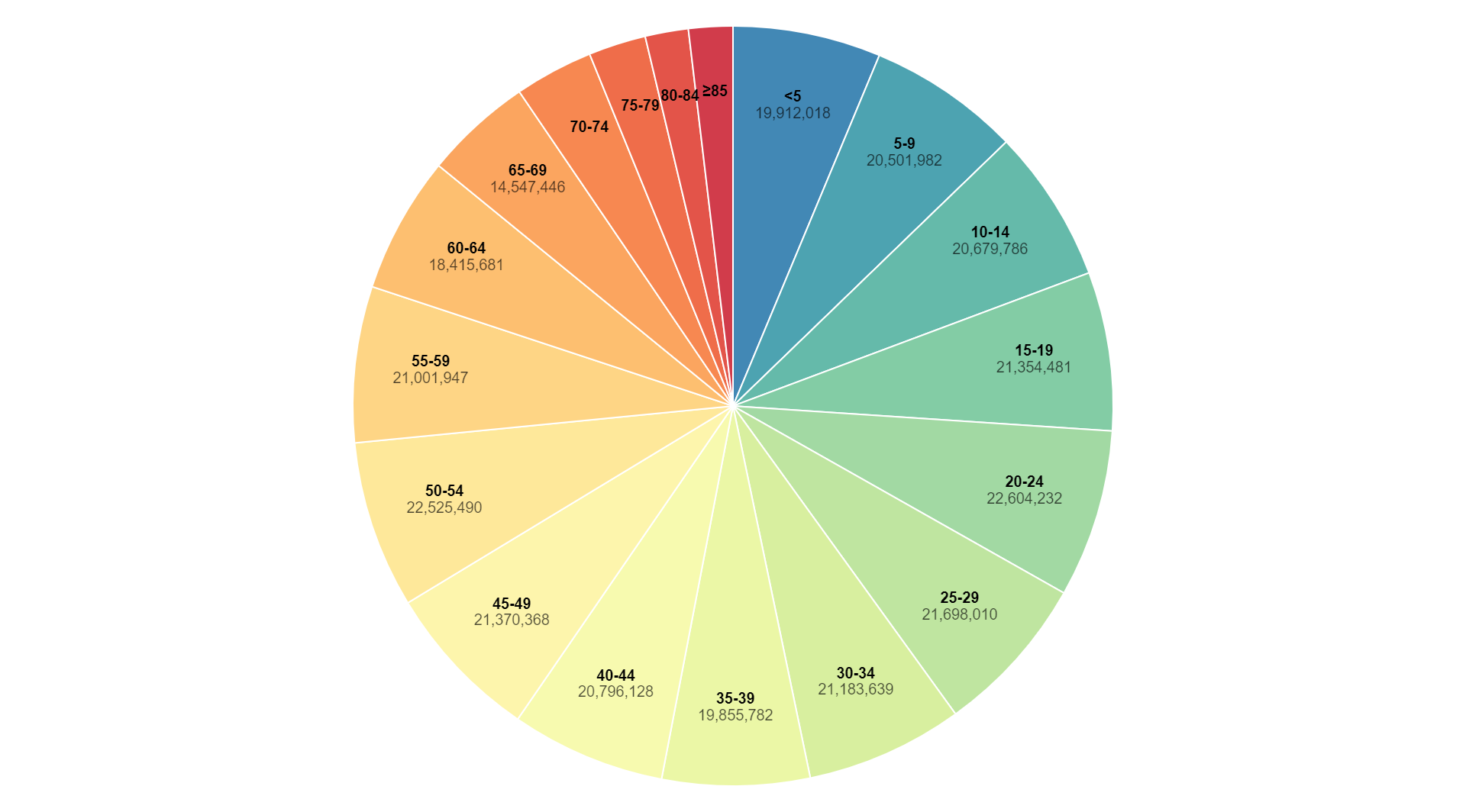
Demographic Analysis: Pie charts are useful for visualizing demographic data, such as age groups, gender distribution, or educational attainment. Each slice represents the proportion of individuals within a specific demographic category, helping researchers or marketers understand their target audience.
Project Resource Allocation: Pie charts can be used to visualize resource allocation for projects, such as time, budget, or manpower. Each slice represents the proportion of resources allocated to a specific task or activity, enabling project managers to track progress and make informed decisions.
Overall, pie charts are suitable for visualizing proportions, comparing categories, highlighting differences, showing part-to-whole relationships, and enhancing the presentation of data in various domains and applications.
ChatGPT can make mistakes. Co
Reviews
There are no reviews yet.
Only logged in customers who have purchased this product may leave a review.
Reviews
There are no reviews yet.