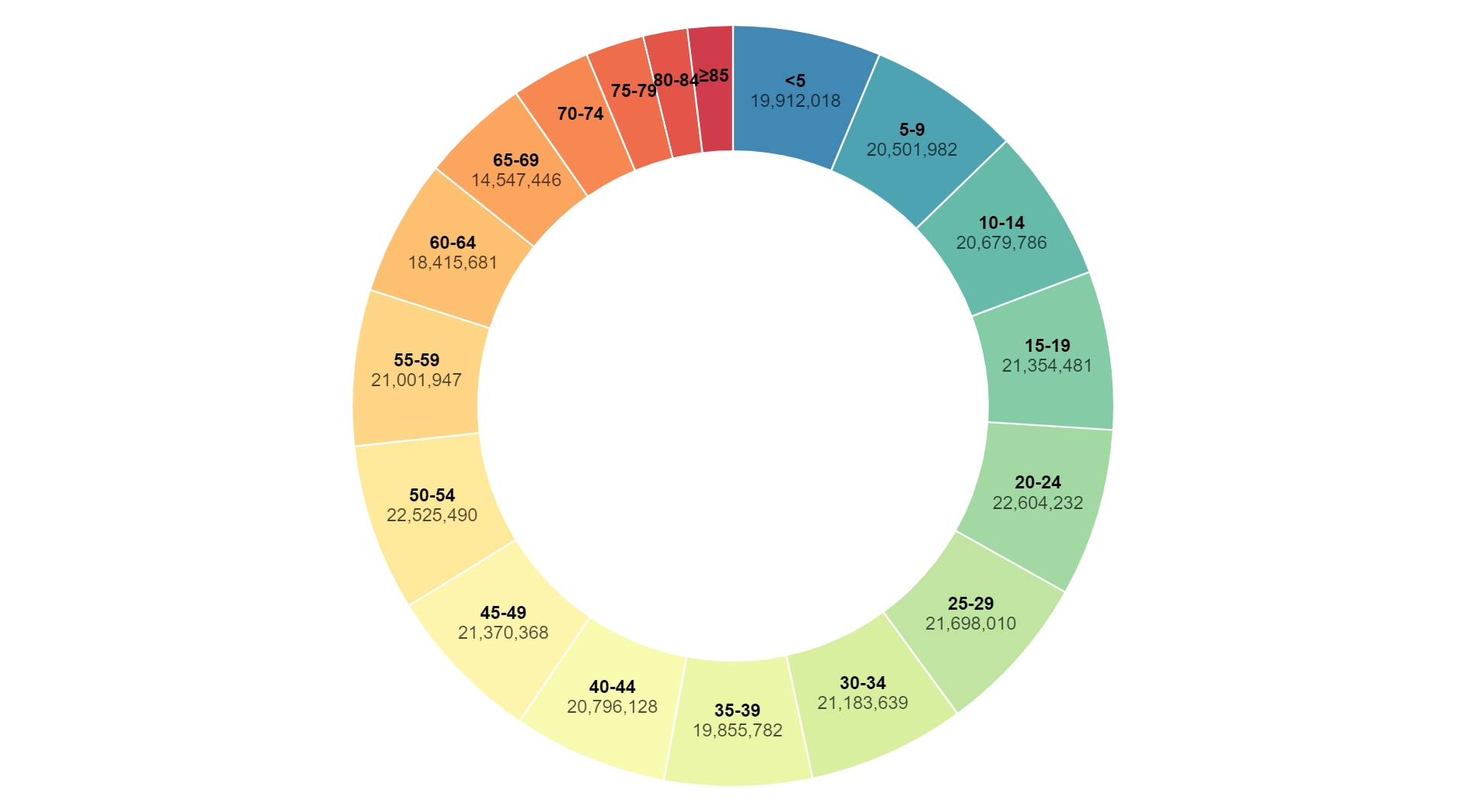
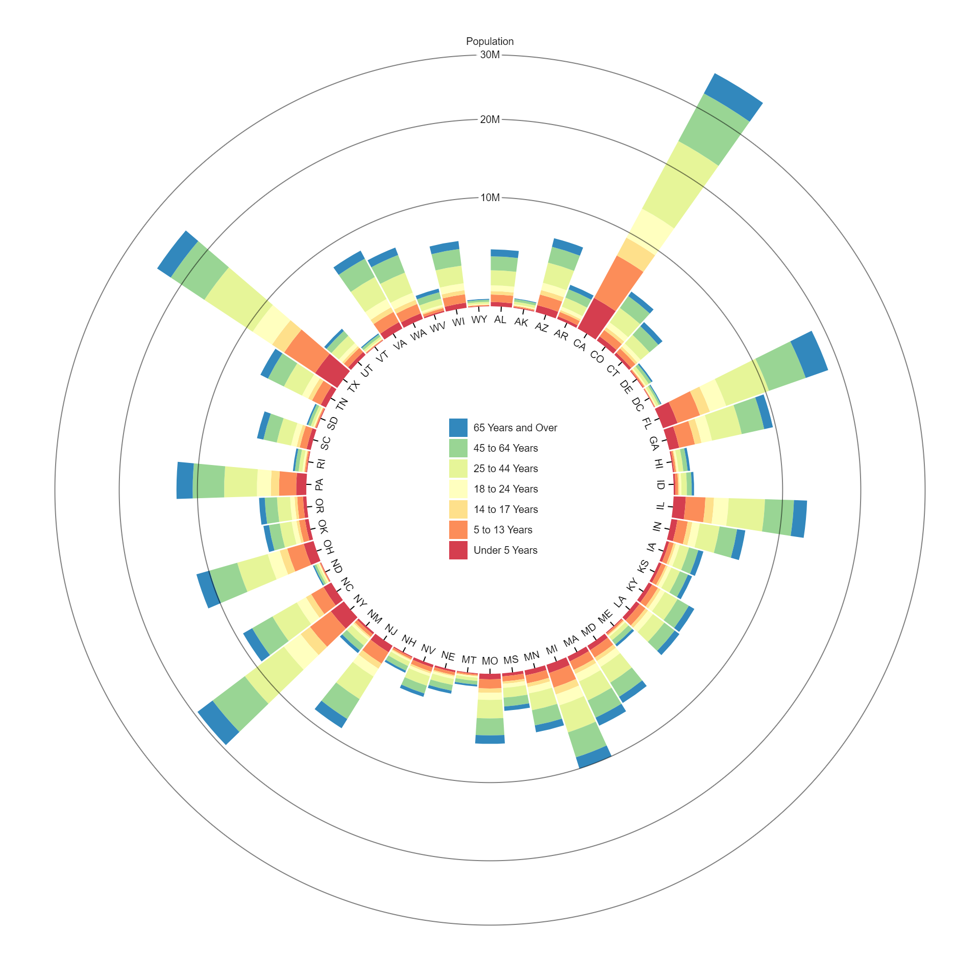
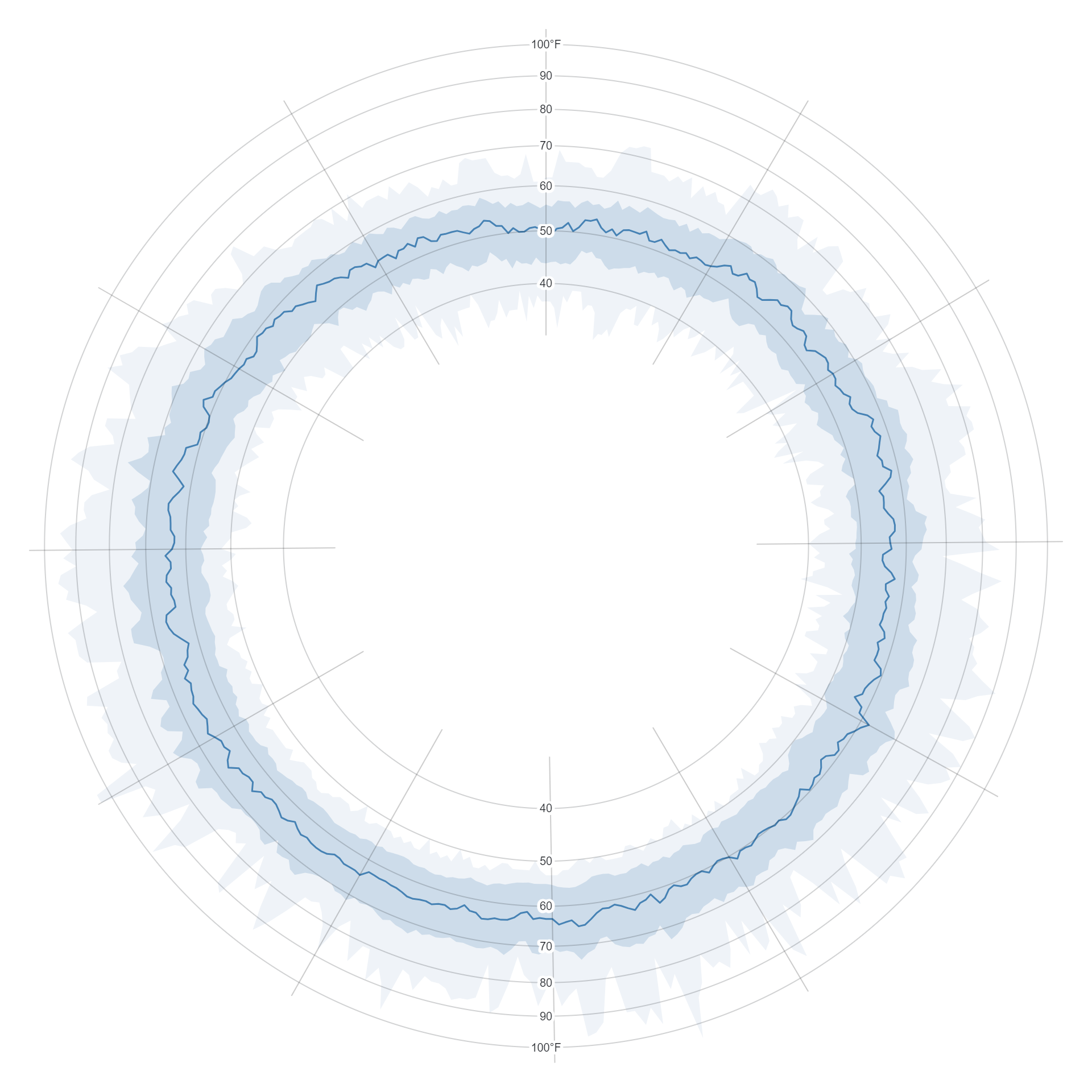
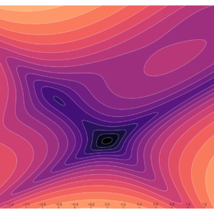
Sale!

Radial Area Chart

Original price was: $ 15.Current price is: $ 10.

Description

A radial area chart is a circular data visualization that displays quantitative data over a continuous range of values, typically representing each data point as a segment of a circle’s circumference. The area enclosed by the segments is shaded or colored to indicate the magnitude of the data values. This chart is effective for visualizing trends and patterns in cyclical or periodic data, as well as comparing multiple datasets across different periods or categories.

Purpose  :

  1. Visualizing Cyclical Trends: Radial area charts are effective for visualizing cyclical or periodic trends in data, such as seasonal patterns, daily fluctuations, or repetitive cycles. The circular layout allows viewers to easily observe the peaks and troughs of the data over time.
  2. Comparing Multiple Datasets: These charts facilitate the comparison of multiple datasets or categories within a dataset. By representing each dataset as a separate ring or layer, viewers can quickly compare the magnitude and distribution of data across different groups or periods.
  3. Highlighting Patterns and Anomalies: Radial area charts help in identifying patterns, trends, and anomalies in the data. Viewers can easily spot areas of high or low values, as well as sudden changes or deviations from the overall trend.
  4. Showing Proportions and Percentages: These charts are useful for displaying proportions or percentages within a whole. The area of each segment represents the relative magnitude of the data values, allowing viewers to understand the distribution of values within the dataset.
  5. Summarizing Data: Radial area charts provide a concise summary of data by visually representing the overall trends and patterns. They condense complex information into a simple and easy-to-understand format, making it easier for viewers to interpret the data.
  6. Enhancing Data Presentation: Radial area charts are visually appealing and can enhance the presentation of data in reports, presentations, and dashboards. Their circular layout and colorful design capture the attention of viewers and make the data more engaging and accessible.

Uses :

  1. Visualizing Seasonal Patterns: Radial area charts are commonly used to visualize seasonal patterns in data, such as temperature variations throughout the year, monthly sales trends, or quarterly financial performance. The circular layout allows viewers to easily observe the cyclicality of the data.
  2. Comparing Multiple Time Series: These charts facilitate the comparison of multiple time series data sets. By representing each data series as a separate ring or layer, viewers can compare the magnitude and distribution of data across different categories, periods, or groups.
  3. Highlighting Trends and Fluctuations: Radial area charts help in highlighting trends and fluctuations in data over time. Viewers can identify areas of growth, decline, or stability, as well as sudden changes or anomalies in the data.
  4. Showing Proportions and Percentages: These charts are useful for visualizing proportions or percentages within a whole. The area of each segment represents the relative magnitude of the data values, allowing viewers to understand the distribution of values within the dataset.
  5. Summarizing Data: Radial area charts provide a concise summary of data by visually representing the overall trends and patterns. They condense complex information into a simple and easy-to-understand format, making it easier for viewers to interpret the data.
  6. Enhancing Data Presentation: Radial area charts are visually appealing and can enhance the presentation of data in reports, presentations, and dashboards. Their circular layout and colorful design capture the attention of viewers and make the data more engaging and accessible.


Reviews

There are no reviews yet.

Only logged in customers who have purchased this product may leave a review.