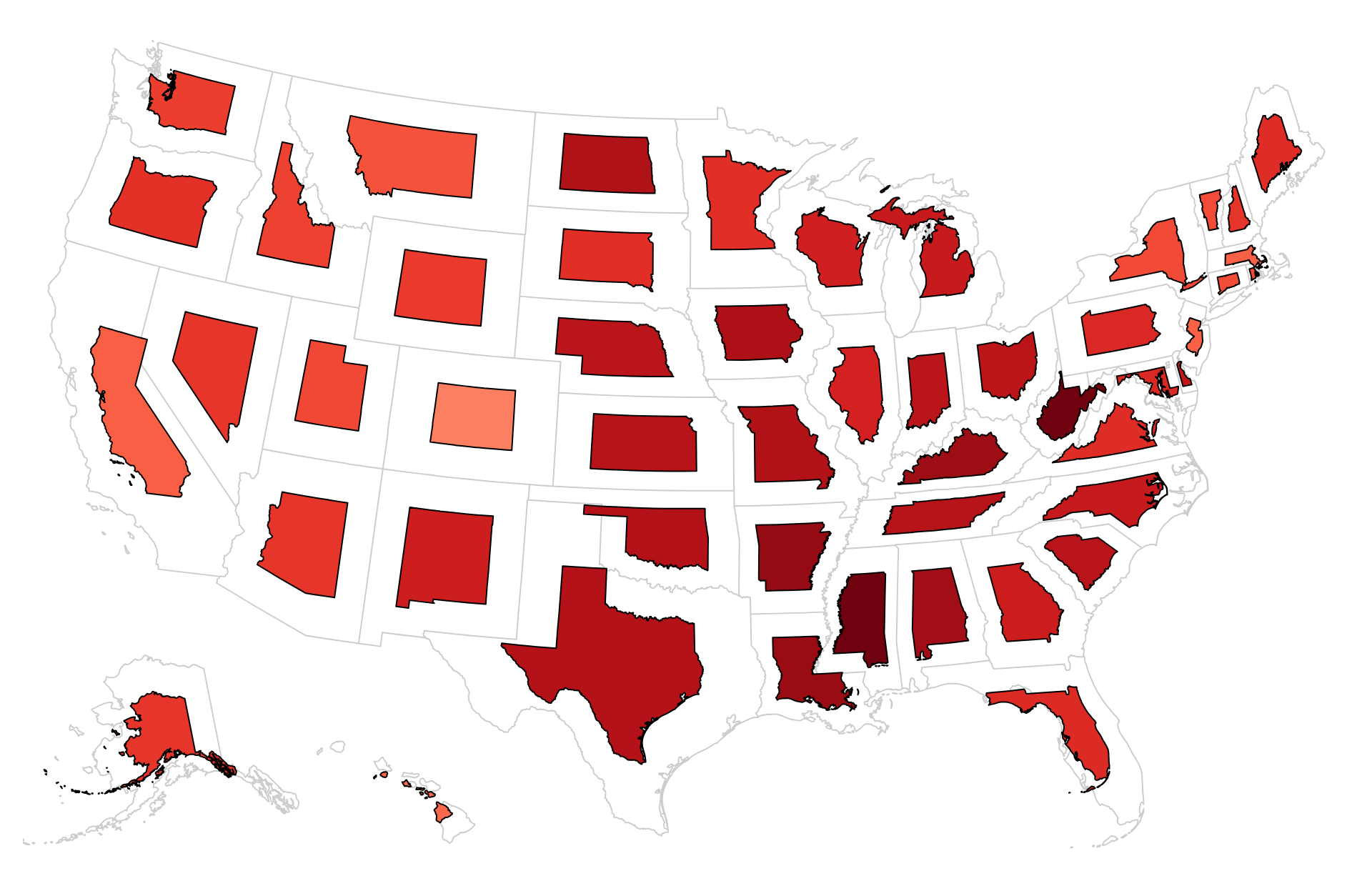
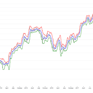
The uses of line charts with missing data include:
- Assessing Trends: Line charts with missing data can still be useful for assessing overall trends in the available dataset. Despite the gaps, users can observe patterns and trends over time or across categories to the extent possible.
- Identifying Data Gaps: These charts help identify areas where data is missing or incomplete. By visually indicating gaps in the lines, users can pinpoint specific time periods or categories where data collection may be lacking.
- Comparing Available Data: Line charts with missing data allow users to compare available data points and assess differences or similarities between them. This can provide insights into variations in trends or patterns across different segments of the dataset.
- Supporting Decision-Making: Even with missing data, line charts can still provide valuable insights that inform decision-making processes. Users can use the available data to make informed decisions or identify areas where additional data collection efforts may be needed.
- Communicating Data Limitations: Line charts with missing data can be used to effectively communicate the limitations of the dataset to stakeholders and decision-makers. By visually indicating where data is missing, these charts help manage expectations and ensure transparency in data-driven discussions.
- Prioritizing Data Collection: Line charts with missing data can help prioritize data collection efforts by identifying areas where data is most needed. Users can focus on filling in the gaps in the dataset to improve its completeness and reliability.
Overall, line charts with missing data serve as valuable tools for assessing trends, identifying data gaps, comparing available data, supporting decision-making, communicating data limitations, and prioritizing data collection efforts.

Reviews
There are no reviews yet.