Description:
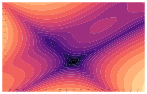
A contour plot, is a type of graph used to represent three-dimensional data in two dimensions. This particular plot uses a color gradient ranging from dark purple to orange, and white contour lines to show the distribution and gradient of values on the plot. The x-axis and y-axis are labeled with numerical values ranging from -1.8 to 1.8. The center of the plot has closely spaced contours, indicating a steep gradient or a peak or trough in the data. Contour plots like this one are often used in various fields such as geography, meteorology, and engineering to visualize complex data sets and understand patterns, trends, and gradients in the data. The specific use of this plot would depend on the data it represents. Without more context or labels, it’s hard to determine the exact data this plot represents.
Uses:
- Geography: Used to create topographical maps which show varying elevations on a landscape.
- Meteorology: Used to visualize atmospheric pressure, temperature, or precipitation distribution.
- Oceanography: Used to display the depth of ocean floors or distribution of temperatures in oceans.
- Physics: Used to represent the distribution and intensity of electromagnetic fields.
- Engineering: Used to visualize heat dispersion in a particular area or material.
- Environmental Science: Used to map the concentration of pollutants in the air across different regions.
- Agriculture: Used to show variations in soil composition and nutrients across a landscape.
- Economics: Used to visualize economic data like income distribution across different regions.
- Scientific Research: Used to analyze and visualize data in experiments.
- Geology: Used to map the concentration of minerals or natural resources underground.
Purposes:
- Data Visualization: Contour charts provide a way to visualize three-dimensional data in two dimensions.
- Pattern Recognition: They help in identifying patterns and trends in complex data.
- Highlighting Extremes: Contour charts can highlight areas of maximum and minimum values in the data.
- Understanding Relationships: They can help understand the relationship between three variables.
- Simplifying Complex Data: Contour charts can simplify the representation of complex multivariate data.
- Spatial Analysis: They are used in spatial analysis and spatial data visualization.
- Gradient Analysis: Contour charts can help understand the gradient or rate of change of a variable.
- Decision Making: They can aid in decision making by providing a clear visual representation of data.
- Predictive Analysis: Contour charts can be used in predictive analysis by helping to identify trends and future behavior.
- Scientific Exploration: They are used in various fields of scientific exploration to understand and interpret data.

Reviews
There are no reviews yet.