Description
Description:
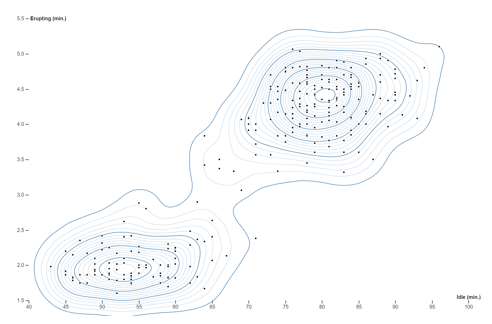
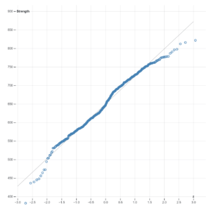
A contour plot, is a type of graph used to represent three-dimensional data in two dimensions. This particular plot has two variables: “Idle (min.)” on the x-axis and “Erupting (min.)” on the y-axis. The x-axis ranges from 40 to 100, and the y-axis ranges from 1.5 to 5.5. The contour lines on the plot represent regions of similar values, forming two distinct clusters or groups. These clusters indicate that there are two main groupings of data points with similar erupting and idle times. There are also several scattered dots on the plot, which likely represent individual data points. One cluster is centered around approximately (55,2) and another around approximately (80,4) on the x,y coordinates respectively. Without additional context, it’s hard to determine what specific data this plot represents. However, contour plots like this are often used in various fields such as physics, engineering, and data analysis to visualize complex data sets and understand patterns, trends, and gradients in the data.
Uses:
- Data Analysis: The chart can be used to analyze the relationship between two variables, in this case, “Erupting (min.)” and “Idle (min.)”.
- Prediction: It can be used to predict the idle time based on the erupting time.
- Pattern Visualization: The chart can be used to visualize data distribution patterns.
- Outlier Identification: It can be used to identify outliers in the data.
- Data Density Analysis: The chart can be used to understand data density and concentration areas.
- Data Comparison: It can be used to compare multiple datasets by overlaying them on a similar chart type.
- Report Enhancement: The chart can enhance reports or presentations with visual data representation.
- Statistical Analysis: It can assist in statistical analysis to identify correlations or trends.
- Education: The chart can aid educational purposes to explain concepts related to data visualization and interpretation.
- Decision Making: It can support decision-making processes where these two variables are crucial.
Purposes: - Data Analysis: The chart can be used to analyze the relationship between two variables, in this case, “Erupting (min.)” and “Idle (min.)”.
- Data Visualization: It serves the purpose of visualizing data distributions.
- Pattern Identification: The chart can be used to identify patterns or trends in the data.
- Data Comparison: It can be used for comparing different data sets or groups.
- Density Estimation: The chart serves the purpose of estimating probability densities.
- Correlation Analysis: It can be used to understand correlations or dependencies between variables.
- Predictive Analysis: The chart can be used for making predictions based on the observed patterns.
- Anomaly Detection: It can be used to identify outliers or anomalies in the data.
- Decision Making: The chart can enhance decision-making processes by providing visual insights into complex data sets.
- Communication: It serves the purpose of communicating findings effectively to those who are not experts in reading raw statistical data.
Only logged in customers who have purchased this product may leave a review.
Related products
-
- Sale!
Box plot
- Original price was: $ 15.$ 10Current price is: $ 10.
- Add to cart
-
- Sale!
Nested Tree Map
- Original price was: $ 15.$ 10Current price is: $ 10.
- Add to cart
-
- Sale!
Normal Quantile Plot
- Original price was: $ 15.$ 10Current price is: $ 10.
- Add to cart
Reviews
There are no reviews yet.