Description
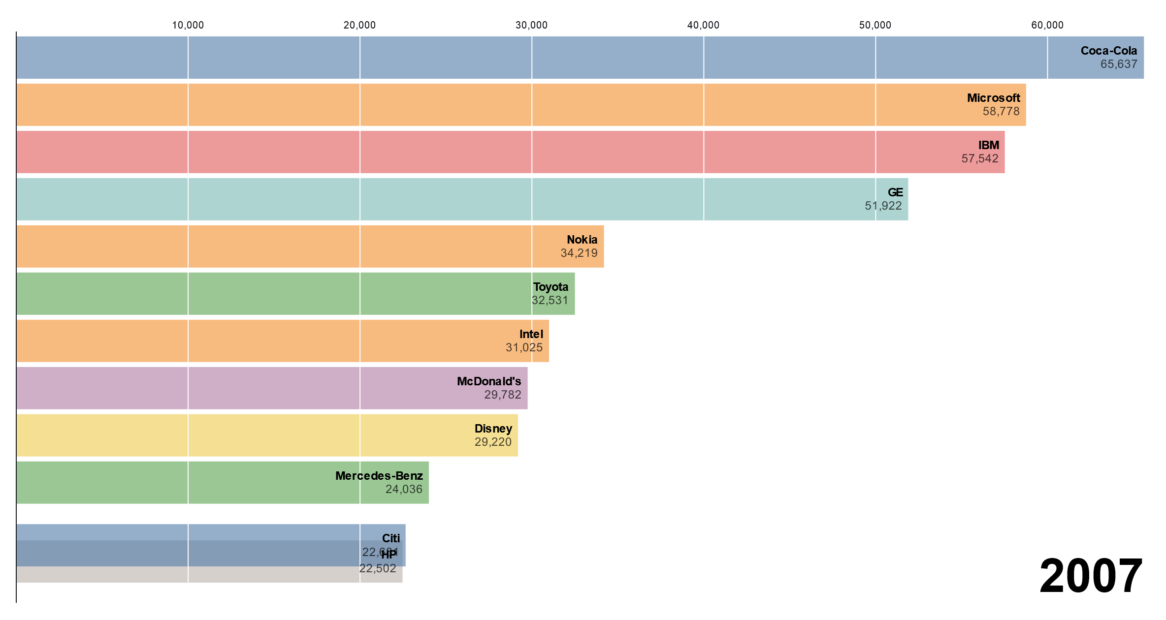
A Bar Chart Race is a dynamic and visually captivating data visualization technique used to illustrate changes in rank or magnitude of categories over time. Unlike static bar charts where data is presented at a single point in time, a Bar Chart Race animates the transition of bars representing different categories as they change in position or height over a specified time period. The bars typically represent categories such as countries, companies, products, or any other entities, while the length or position of each bar reflects a quantitative measure such as revenue, population, or market share. Bar Chart Races are commonly used to visualize trends, patterns, and fluctuations in data over time, providing viewers with an engaging and informative way to understand changes in rank or magnitude across different categories.
Uses:
- Time-Series Analysis: Visualizing changes in the rank or magnitude of categories over time to identify trends and patterns.
- Competitive Analysis: Comparing the performance of different entities such as companies, products, or countries over time.
- Population Dynamics: Illustrating changes in population size or demographic composition of regions or countries over time.
- Market Share Analysis: Tracking changes in market share of companies or brands within a specific industry over time.
- Economic Trends: Visualizing economic indicators such as GDP growth, inflation rates, or unemployment rates across different countries or regions over time.
- Sports Statistics: Showing the performance of sports teams or athletes in competitions over time, such as rankings in league tables or tournament standings.
- Social Media Trends: Analyzing trends in social media metrics such as likes, shares, or followers of accounts over time.
- Scientific Research: Visualizing changes in scientific data over time, such as rankings of universities, citations of research papers, or species populations.
- Public Health: Illustrating trends in public health indicators such as disease prevalence, vaccination rates, or life expectancy across different regions over time.
- Environmental Data: Tracking changes in environmental metrics such as carbon emissions, temperature levels, or deforestation rates over time.
Purposes:
- Highlight Trends: Highlighting trends and patterns in data over time to understand how different categories evolve.
- Engage Audiences: Engaging audiences with visually appealing animations that make data exploration more interactive and entertaining.
- Compare Entities: Comparing the performance or characteristics of different entities over time to identify leaders, laggards, or emerging players.
- Communicate Insights: Communicating insights derived from data analysis in a clear and accessible manner to stakeholders or the general public.
- Inform Decision-Making: Informing decision-making processes by providing decision-makers with data-driven insights into trends and patterns over time.
- Educate Stakeholders: Educating stakeholders or the public about complex phenomena or trends by visualizing them in a comprehensible and engaging format.
- Predict Future Trends: Using historical data to predict future trends or outcomes based on observed patterns in the Bar Chart Race.
- Identify Outliers: Identifying outliers or anomalies in the data that deviate significantly from expected trends or patterns.
- Track Progress: Tracking progress towards goals or objectives over time by visualizing changes in relevant metrics.
- Raise Awareness: Raising awareness about important issues or trends by visualizing them in a compelling and easy-to-understand format.
Only logged in customers who have purchased this product may leave a review.
Related products
-
- Sale!
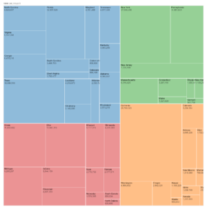
Circle Packing
- Original price was: $ 15.$ 10Current price is: $ 10.
- Add to cart
-
- Sale!
Bollinger bands
- Original price was: $ 15.$ 10Current price is: $ 10.
- Add to cart
-
- Sale!
Radial Cluster Tree
- Original price was: $ 15.$ 10Current price is: $ 10.
- Add to cart
Reviews
There are no reviews yet.