Description
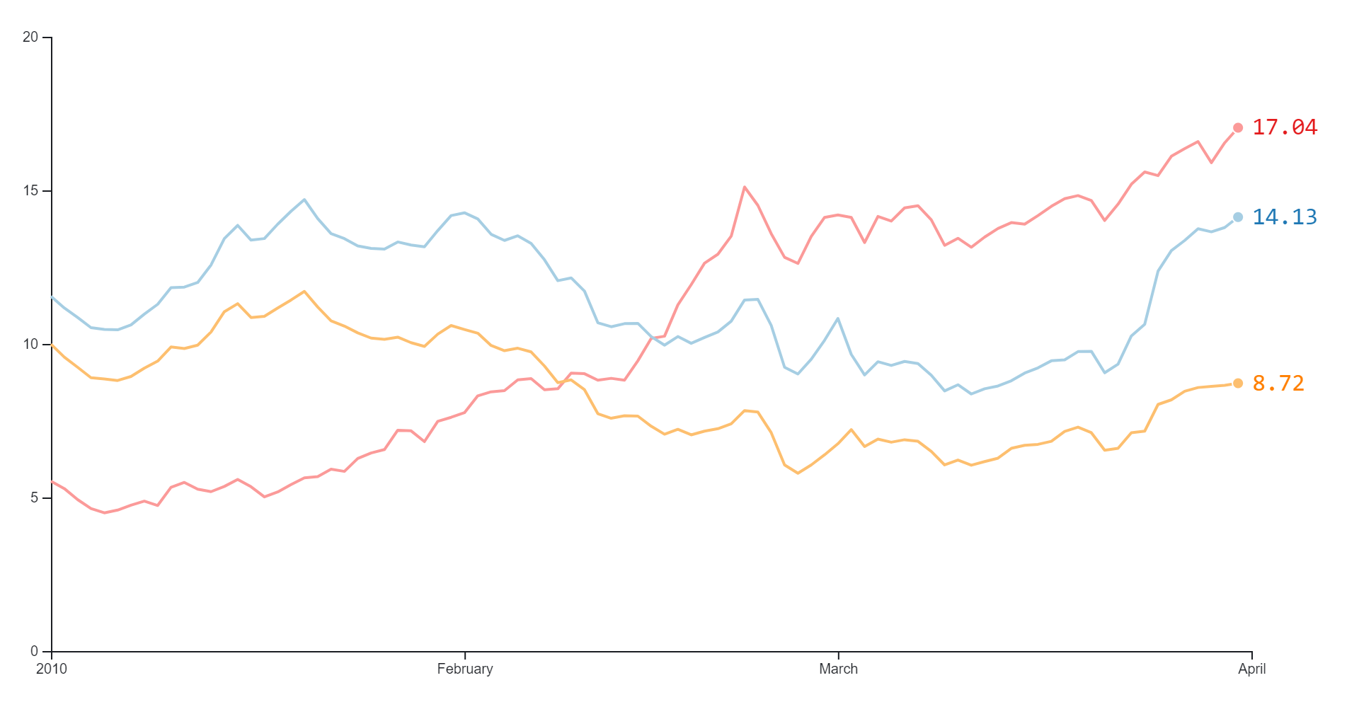
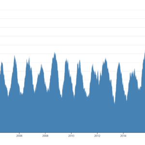
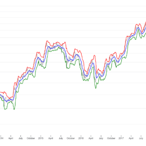
The Quick View Line Chart with Tooltip is a versatile and dynamic data visualization tool used to present trends, patterns, and relationships within a dataset. This chart format typically displays a line graph representing changes in a variable over time or across different categories. Each data point on the line corresponds to a specific value, and the lines connect these points to illustrate the overall trend. The addition of tooltips enhances the chart by providing detailed information about individual data points when users hover over them with their cursor. These tooltips typically display the precise value of the data point, along with any additional context or metadata associated with it. This interactive feature allows users to explore the data in more depth, gaining insights and understanding specific trends or anomalies. The Quick View Line Chart with Tooltip is commonly used in various fields such as finance, analytics, and business intelligence, where understanding temporal or categorical data is crucial for decision-making. Its intuitive interface and interactive nature make it a powerful tool for data exploration, analysis, and communication. Additionally, its ability to convey complex information in a clear and visually appealing manner makes it a popular choice for presenting insights to stakeholders, clients, or colleagues.
Uses:
- Visualizing Trends Over Time: Line charts with tooltips are commonly used to visualize trends in data over time, such as stock prices, temperature variations, or website traffic.
- Comparing Multiple Data Series: They are useful for comparing multiple data series on the same chart, allowing users to easily identify patterns and relationships.
- Identifying Anomalies: Line charts with tooltips help users identify anomalies or outliers in the data by providing detailed information about individual data points.
- Exploring Data Dynamics: They enable users to explore the dynamics of the data by interacting with tooltips to view specific values or metadata associated with each data point.
- Analyzing Seasonal Patterns: Line charts with tooltips are effective for analyzing seasonal patterns or cyclic trends in data, such as sales figures or energy consumption.
- Monitoring Performance: They are used for monitoring performance metrics over time, allowing users to track progress and identify areas for improvement.
- Communicating Insights: Line charts with tooltips are valuable for communicating insights and trends to stakeholders, clients, or colleagues in a clear and visually appealing manner.
- Forecasting Trends: They can aid in forecasting future trends based on historical data, allowing users to make informed decisions and predictions.
- Detecting Trends Shifts: Line charts with tooltips help users detect shifts or changes in trends over time, which may indicate changes in market conditions or consumer behavior.
- Understanding Correlations: They assist in understanding correlations between different variables by visually representing their relationship over time.
Purposes:
- Data Exploration: Line charts with tooltips facilitate data exploration by providing users with interactive tools to explore individual data points and understand trends.
- Data Analysis: They support data analysis by allowing users to interact with tooltips to view detailed information about data points and perform comparative analysis.
- Decision Making: Line charts with tooltips aid in decision-making processes by providing users with insights into trends and patterns in the data.
- Performance Monitoring: They are used for monitoring performance metrics and KPIs over time, enabling users to track progress and make data-driven decisions.
- Data Communication: Line charts with tooltips serve as effective communication tools for presenting insights and trends to stakeholders, clients, or colleagues.
- Error Identification: They help users identify errors or discrepancies in the data by providing detailed information about individual data points.
- Pattern Recognition: Line charts with tooltips assist users in recognizing patterns and trends in the data by visualizing their relationships over time.
- Educational Tool: They serve as educational tools for teaching data analysis concepts and techniques, allowing users to interact with tooltips to gain a deeper understanding of the data.
- Performance Evaluation: Line charts with tooltips are used for evaluating the performance of strategies, campaigns, or initiatives over time.
- Insights Generation: They aid in generating insights and hypotheses about the data by allowing users to interact with tooltips to explore relationships and trends.
Only logged in customers who have purchased this product may leave a review.
Related products
-
- Sale!
Tidy Tree
- Original price was: $ 15.$ 10Current price is: $ 10.
- Add to cart
-
- Sale!
Moving Average Chart
- Original price was: $ 15.$ 10Current price is: $ 10.
- Add to cart
-
- Sale!
Bollinger bands
- Original price was: $ 15.$ 10Current price is: $ 10.
- Add to cart
Reviews
There are no reviews yet.