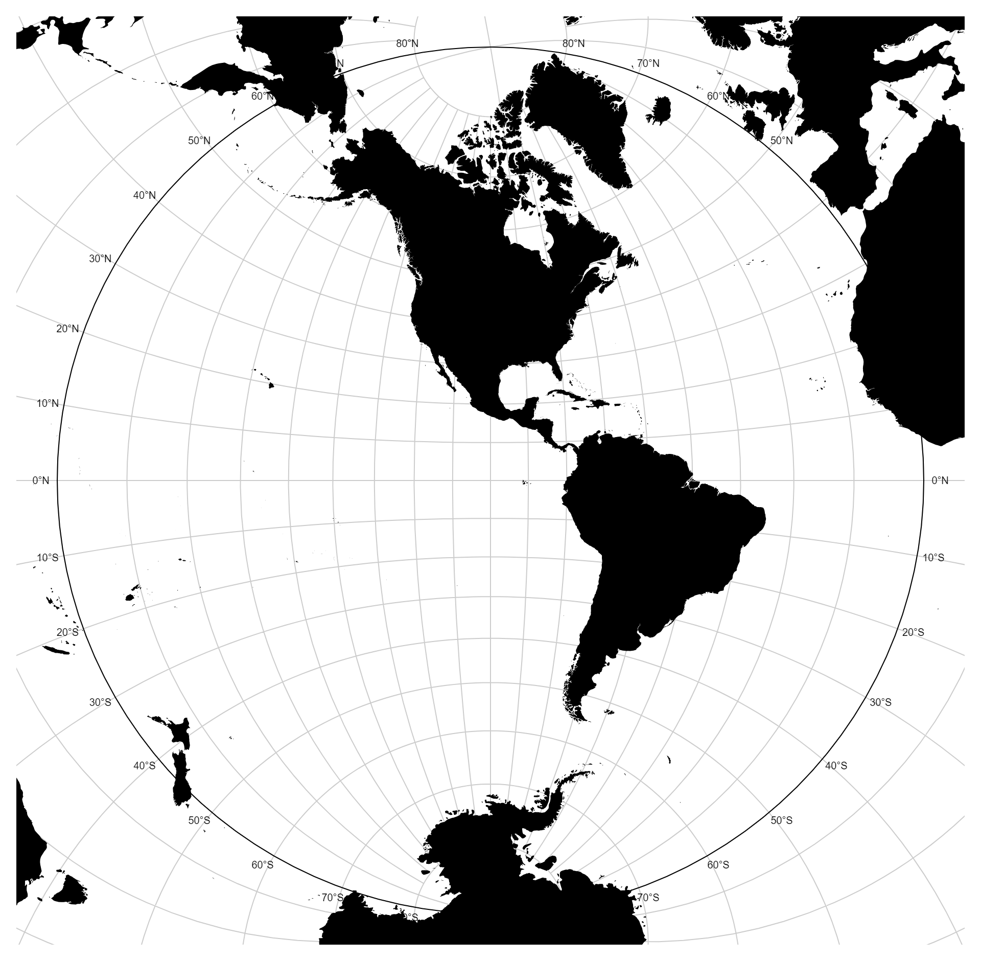
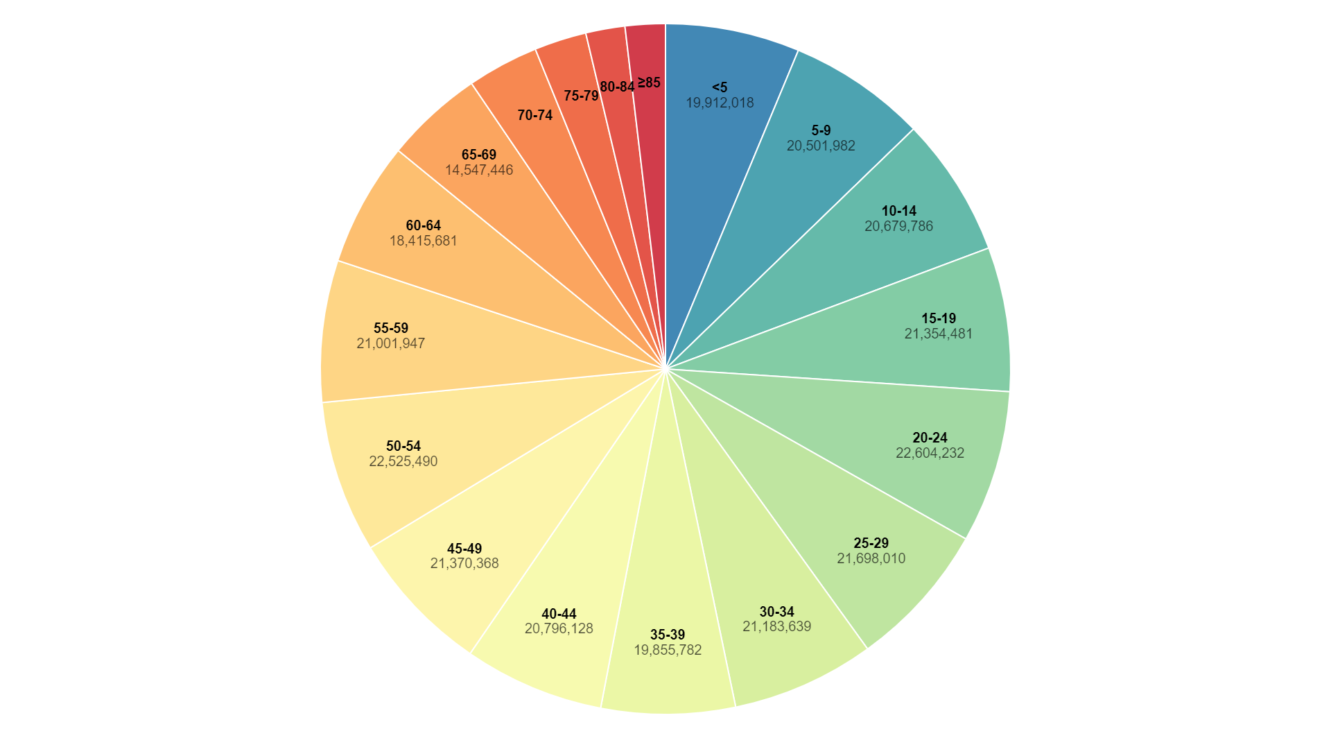
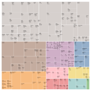
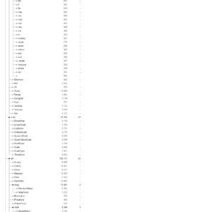
Description
Styles axis charts, also known as styled axis charts, are a type of data visualization that presents information using various visual styles or decorations applied to the axes of the chart. Unlike traditional axis charts with plain or simple axis lines and labels, styles axis charts incorporate additional design elements, such as color, font styles, shapes, or decorative elements, to enhance the visual appeal and aesthetics of the chart. These visual styles can be applied to the axis lines, tick marks, labels, titles, or any other components of the axes, allowing for creative customization and personalization of the chart’s appearance. The purpose of styles axis charts is not only to present data in a visually appealing manner but also to convey additional information or context through the design elements used. For example, different colors or shapes on the axes may represent different categories or data groups, while decorative elements or embellishments can add a sense of style or personality to the chart. Styles axis charts are commonly used in presentations, reports, infographics, or other visual communication mediums where aesthetics and visual impact are important considerations. By incorporating creative design elements into the axes of the chart, styles axis charts provide a visually engaging and memorable way to present and communicate data to audiences.
Uses:
- Data Presentation: Styles axis charts are used to visually present data in a more engaging and visually appealing manner compared to traditional axis charts.
- Visualization Enhancement: They enhance the visualization of data by incorporating various visual styles, such as colors, fonts, shapes, and decorative elements, into the axes of the chart.
- Communication: Styles axis charts aid in effectively communicating information to audiences by leveraging visual elements that attract attention and facilitate understanding.
- Brand Representation: They can be used to represent a brand’s identity or visual style by incorporating brand colors, fonts, or other design elements into the axes of the chart.
- Customization: Styles axis charts allow for customization and personalization of the chart’s appearance, enabling users to create visually unique and tailored visualizations.
- Data Exploration: They support data exploration by providing users with visually stimulating charts that encourage interaction and exploration of the data.
- Comparison: Styles axis charts facilitate comparison between different data categories or groups by using distinct visual styles for each category on the axes.
- Highlighting: They help highlight specific data points, trends, or patterns by applying different visual styles to relevant elements on the axes.
- Storytelling: Styles axis charts can be used to tell a visual story by incorporating visual elements that guide the viewer’s attention and convey meaning or context.
- Engagement: They increase viewer engagement with the data by presenting it in a visually attractive and compelling format that captures attention and encourages exploration.
Purposes:
- Visual Appeal: The purpose of styles axis charts is to enhance the visual appeal of data visualizations by incorporating attractive design elements into the axes.
- Emphasis: They are used to emphasize important data points, trends, or insights by applying distinctive visual styles to relevant elements on the axes.
- Differentiation: Styles axis charts help differentiate between different data categories or groups by using unique visual styles for each category on the axes.
- Contextualization: They provide context and meaning to the data by incorporating visual elements that convey additional information or context related to the data.
- Brand Representation: Styles axis charts serve as a representation of a brand’s visual identity or style by incorporating brand colors, fonts, or other design elements into the axes.
- Communication Aid: They aid in communicating complex information more effectively by leveraging visual styles that attract attention and facilitate understanding.
- Interactivity: Styles axis charts encourage user interaction and exploration of the data by presenting it in a visually stimulating and interactive format.
- Memory Aid: They serve as a memory aid by creating visually memorable charts that are more likely to be retained and recalled by viewers.
- Creativity: Styles axis charts encourage creativity and experimentation in data visualization by providing opportunities for innovative design and customization.
- Attention Management: They help manage viewer attention by using visual styles that guide the viewer’s focus towards specific data points or elements on the axes.
Only logged in customers who have purchased this product may leave a review.
Reviews
There are no reviews yet.