Description
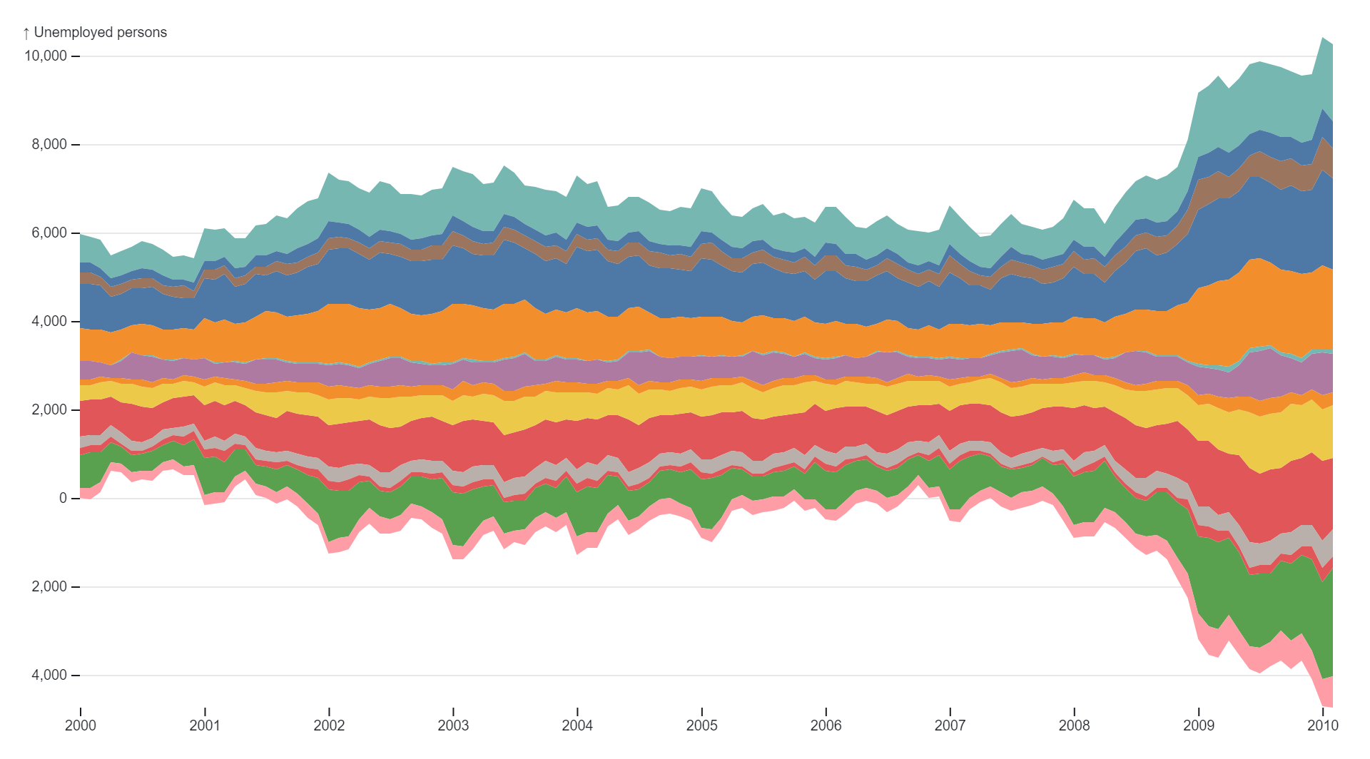
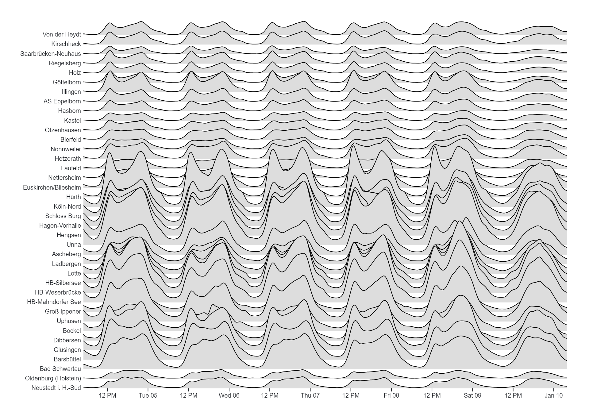
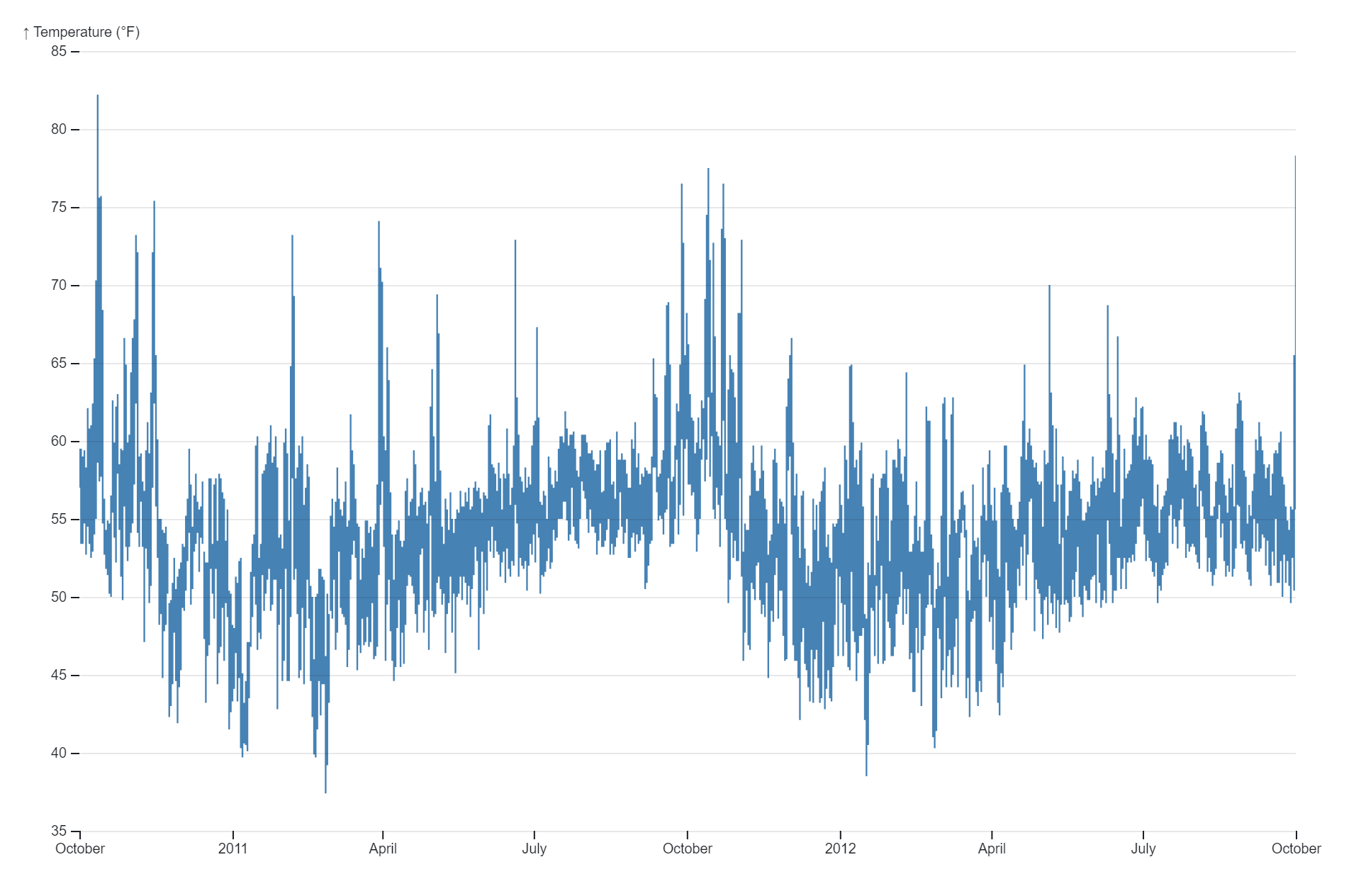
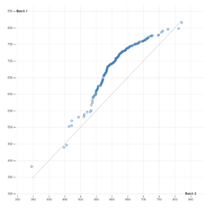
Band charts, also known as range area charts or range bands, are a type of data visualization used to represent ranges or intervals of values over time or across categories. Unlike traditional line charts or area charts that depict a single data series, band charts display multiple bands or shaded areas to illustrate the variability or uncertainty associated with the data. Each band represents a range of values, with the lower and upper bounds of the range indicated by the bottom and top edges of the band, respectively. Band charts are commonly used to visualize statistical measures such as confidence intervals, standard deviations, or interquartile ranges, providing insights into the dispersion or variability of the data. They are particularly useful for identifying trends, patterns, and outliers within the data while simultaneously conveying the level of uncertainty or variability associated with each data point or category. Band charts find applications in various fields such as finance, where they are used to depict stock price volatility or market fluctuations, and in scientific research, where they are employed to visualize experimental data and uncertainty ranges. Additionally, band charts are effective for communicating uncertainty to stakeholders, decision-makers, or the general public, helping to facilitate informed decision-making and risk assessment. Overall, band charts offer a visually compelling and informative way to represent ranges of values and variability in data, making them a valuable tool for data visualization and analysis.
Uses:
- Visualizing Uncertainty: Band charts are commonly used to visualize uncertainty or variability in data, such as confidence intervals or prediction intervals.
- Comparing Data Sets: They allow for the comparison of multiple data sets or categories by displaying bands of different colors or patterns.
- Tracking Trends: Band charts can be used to track trends over time or across categories while simultaneously showing the range of variation.
- Risk Assessment: They aid in risk assessment by highlighting the potential range of outcomes or variability associated with certain events or decisions.
- Statistical Analysis: Band charts are useful for statistical analysis, allowing analysts to examine the spread of data and assess its reliability.
- Financial Analysis: In finance, band charts are employed to visualize volatility or uncertainty in stock prices, bond yields, or other financial metrics.
- Environmental Monitoring: They are used in environmental monitoring to visualize ranges of data such as temperature fluctuations or pollution levels.
- Quality Control: Band charts assist in quality control processes by displaying tolerance ranges or acceptable variation limits for manufacturing or production processes.
- Healthcare Analytics: In healthcare, band charts help visualize ranges of medical data such as blood pressure, glucose levels, or patient outcomes.
- Scientific Research: They find applications in scientific research for visualizing experimental data, uncertainty ranges, or variability in measurements.
Purposes:
- Representation of Ranges: The primary purpose of band charts is to represent ranges or intervals of data values in a visually intuitive manner.
- Visualization of Uncertainty: They help visualize uncertainty or variability in data, providing insights into the potential range of outcomes or variation.
- Communication of Risk: Band charts aid in communicating risk by visually depicting the range of possible outcomes or variability associated with certain events or decisions.
- Insights Generation: They facilitate insights generation by allowing users to identify trends, patterns, or outliers within the data while considering its variability.
- Decision Support: Band charts support decision-making processes by providing decision-makers with a comprehensive understanding of the range of possibilities or risks associated with certain actions or scenarios.
- Enhanced Data Interpretation: They enhance data interpretation by visually representing the spread or dispersion of data, enabling users to better understand its distribution and variability.
- Comparative Analysis: Band charts facilitate comparative analysis by allowing users to compare the ranges of different data sets or categories side by side.
- Quality Assurance: They assist in quality assurance processes by visualizing tolerance ranges or acceptable variation limits, helping ensure product or process quality.
- Forecasting and Prediction: Band charts aid in forecasting and prediction by providing insights into the potential range of future outcomes or predictions based on historical data.
- Transparency and Accountability: Band charts promote transparency and accountability by providing stakeholders with a clear visual representation of the uncertainty or variability associated with data, fostering trust and informed decision-making.
Only logged in customers who have purchased this product may leave a review.
Reviews
There are no reviews yet.