Description
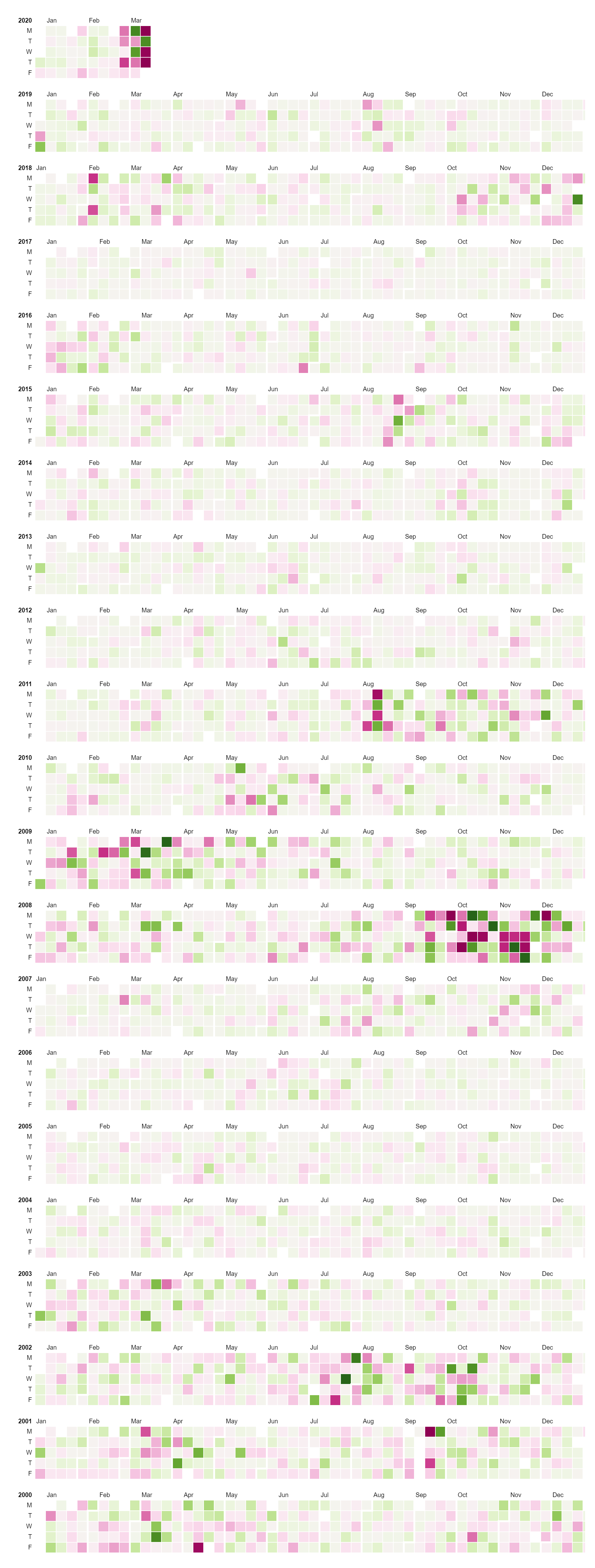
Calendar charts, also known as date heatmaps or date-based heatmaps, are a type of data visualization used to represent temporal patterns or trends over a period of time, typically displayed in a calendar format. Each cell in the calendar represents a specific date, and the color intensity or shading of the cell is used to encode the magnitude or frequency of a particular metric or event occurring on that date. Darker shades or brighter colors often indicate higher values or frequencies, while lighter shades or muted colors represent lower values or frequencies. Calendar charts provide a compact and intuitive way to visualize temporal data, allowing users to quickly identify patterns, trends, or anomalies over time. They are commonly used to visualize time series data such as daily sales, website traffic, or social media activity, where understanding fluctuations or trends over time is important for analysis and decision-making. Calendar charts are also effective for identifying seasonality, trends by day of the week, or other cyclical patterns within the data. Additionally, they are valuable for visualizing historical data, tracking progress towards goals or targets, and identifying correlations between time-based events. Overall, calendar charts offer a visually compelling and informative way to represent temporal data in a clear and accessible format, making them a valuable tool for data analysis and visualization across various industries and applications.
Uses:
- Tracking Daily Metrics: Calendar charts are commonly used to track daily metrics such as sales, website visits, or social media engagement over time.
- Visualizing Seasonal Patterns: They aid in visualizing seasonal patterns or fluctuations in data, allowing users to identify trends that occur at specific times of the year.
- Monitoring Events or Activities: Calendar charts are useful for monitoring events, activities, or occurrences on a daily basis, such as project milestones or appointments.
- Analyzing Temporal Trends: They help analyze temporal trends or changes over time, enabling users to identify patterns, anomalies, or trends within the data.
- Identifying Patterns by Day of the Week: Calendar charts facilitate the identification of patterns by day of the week, such as variations in sales or website traffic on weekends versus weekdays.
- Visualizing Historical Data: They are used to visualize historical data, providing a chronological overview of past events, trends, or occurrences.
- Tracking Progress Towards Goals: Calendar charts aid in tracking progress towards goals or targets over time, allowing users to visualize achievements and milestones.
- Forecasting Future Trends: They support forecasting future trends or projections based on historical data, enabling users to make informed predictions or decisions.
- Monitoring Workloads or Resource Allocation: Calendar charts help monitor workloads or resource allocation over time, facilitating resource planning and management.
- Comparing Multiple Time Series: They allow for the comparison of multiple time series data sets side by side, providing insights into how different variables or metrics evolve over time.
Purposes:
- Temporal Analysis: The primary purpose of calendar charts is to visualize temporal data and analyze how variables or metrics change over time.
- Pattern Identification: They aid in identifying patterns, trends, or anomalies within the data by providing a visual representation of temporal relationships.
- Seasonality Analysis: Calendar charts facilitate the analysis of seasonal patterns or cycles within the data, helping users understand recurring trends.
- Data Exploration: They support data exploration by allowing users to interactively visualize and analyze temporal data sets, gaining insights into underlying patterns or trends.
- Decision Support: Calendar charts assist in decision-making processes by providing stakeholders with a clear understanding of temporal trends and patterns, enabling informed decisions.
- Communication: They serve as a communication tool for presenting temporal data in a visually compelling and accessible format, making complex information easier to understand.
- Performance Monitoring: Calendar charts help monitor performance metrics, KPIs, or key milestones over time, enabling users to track progress and make data-driven decisions.
- Resource Planning: They support resource planning and allocation by visualizing workloads, project timelines, or resource usage patterns over time.
- Forecasting and Prediction: Calendar charts aid in forecasting future trends or predictions based on historical data, supporting planning and strategy development.
- Quality Improvement: They facilitate quality improvement processes by identifying temporal trends or patterns that may indicate areas for improvement or optimization.
Only logged in customers who have purchased this product may leave a review.
Related products
-
- Sale!
Clustre Dendogram
- Original price was: $ 15.$ 10Current price is: $ 10.
- Add to cart
-
- Sale!
Nested Tree Map
- Original price was: $ 15.$ 10Current price is: $ 10.
- Add to cart
-
- Sale!
Normal Quantile Plot
- Original price was: $ 15.$ 10Current price is: $ 10.
- Add to cart
Reviews
There are no reviews yet.