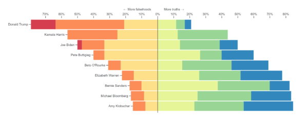
A diverging stacked bar chart is a graphical representation that displays data using stacked bars where each bar is divided into segments representing different categories or subgroups. The bars are aligned along a central axis, with positive values extending to one side of the axis and negative values extending to the other side. This chart type is useful for visualizing the distribution and comparison of data across multiple categories, highlighting both overall trends and deviations from a central reference point.
Purposes :
The purposes of using a diverging stacked bar chart include:
Visualizing Distribution: Diverging stacked bar charts are effective for visualizing the distribution of data across multiple categories or subgroups, particularly when there are both positive and negative values involved.
Highlighting Deviations: They help in highlighting deviations or differences from a central reference point, making it easy to identify outliers or anomalies within the data.
Comparative Analysis: Diverging stacked bar charts facilitate comparative analysis by allowing viewers to compare the composition of different categories or subgroups relative to a common baseline.
Understanding Trends: They aid in understanding trends and patterns within the data, including how different categories contribute to the overall distribution and whether there are any notable shifts over time or across conditions.
Visualizing Part-to-Whole Relationships: Diverging stacked bar charts enable viewers to see both the overall distribution of data and the contribution of individual categories or subgroups to the total, providing insights into part-to-whole relationships.
Impact Assessment: They are useful for assessing the impact of different factors or variables on the overall distribution, helping to identify which categories or subgroups have the most significant influence.
Communicating Insights: Diverging stacked bar charts serve as effective communication tools for presenting complex data in a clear and concise manner, allowing stakeholders to quickly grasp key insights and trends.
Decision Support: They assist in decision-making processes by providing decision-makers with a visual representation of data that can help inform strategic choices or prioritize actions based on the observed distribution and trends.
Detecting Imbalances: Diverging stacked bar charts can reveal imbalances or asymmetries in the distribution of data, drawing attention to areas where adjustments or interventions may be needed.
Comparing Positive and Negative Values: They are particularly useful for comparing positive and negative values within the same dataset, such as gains and losses, expenditures and revenues, or strengths and weaknesses.
Uses :
Certainly! Here are some common uses of diverging stacked bar charts:
Performance Comparison: Diverging stacked bar charts are used to compare the performance of multiple entities or categories across various dimensions. For instance, comparing the revenue contribution of different product lines or departments within a company.
Budget Allocation: They help visualize budget allocations across different categories or departments, highlighting areas of overspending or underfunding relative to a set budget target.
Sentiment Analysis: Diverging stacked bar charts are employed in sentiment analysis to visualize the distribution of positive and negative sentiments across different topics or time periods.
Market Share Analysis: They assist in analyzing market share by visualizing the distribution of market share among competitors within an industry or market segment.
Risk Assessment: Diverging stacked bar charts are used in risk assessment to visualize the distribution of risks across different categories or factors, helping stakeholders identify areas of high risk and prioritize mitigation efforts.
Survey Analysis: They help visualize survey responses across different categories or demographic groups, highlighting differences in opinions or preferences.
Performance Evaluation: Diverging stacked bar charts are used to evaluate the performance of individuals, teams, or departments by visualizing key performance indicators (KPIs) across different dimensions.
Customer Satisfaction Analysis: They assist in analyzing customer satisfaction by visualizing the distribution of satisfaction levels across different products, services, or touchpoints.
Productivity Analysis: Diverging stacked bar charts help visualize productivity metrics across different teams, projects, or time periods, allowing stakeholders to identify areas of improvement or inefficiency.
Healthcare Analytics: They are used in healthcare analytics to visualize patient outcomes across different treatments or interventions, helping healthcare providers identify best practices and improve patient care.
Reviews
There are no reviews yet.
Only logged in customers who have purchased this product may leave a review.

Reviews
There are no reviews yet.