Sale!

Bubble chart

Original price was: $ 15.Current price is: $ 10.

Description

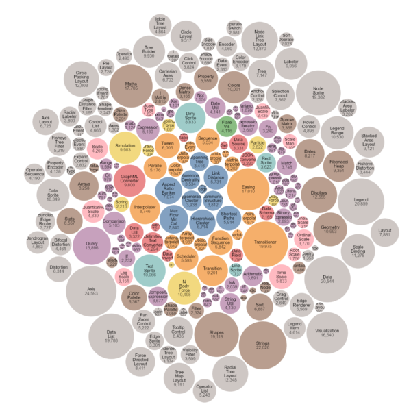
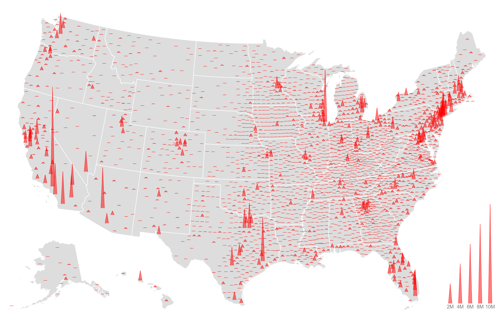
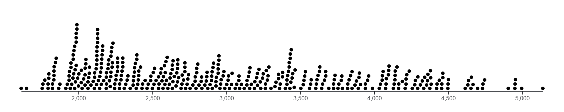
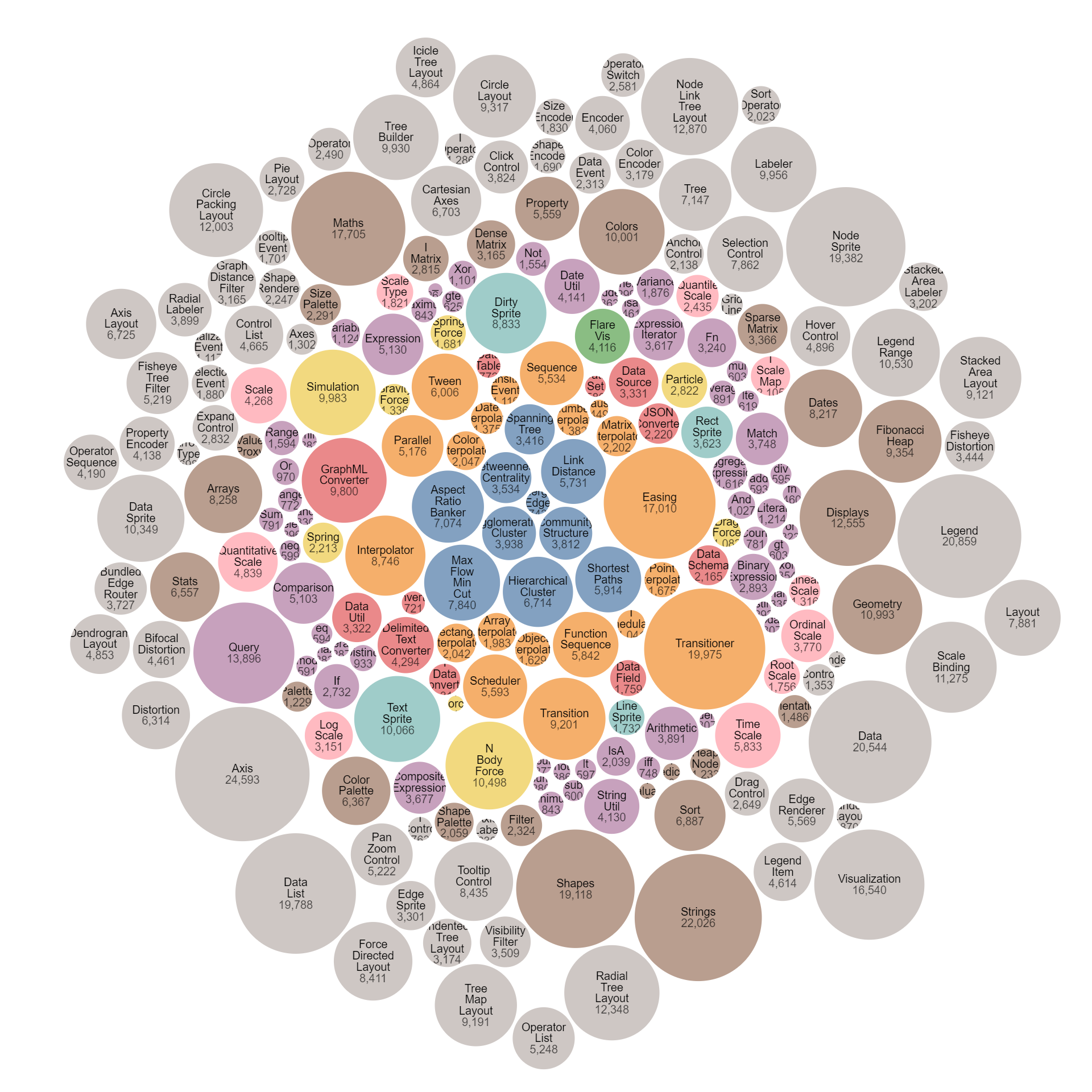
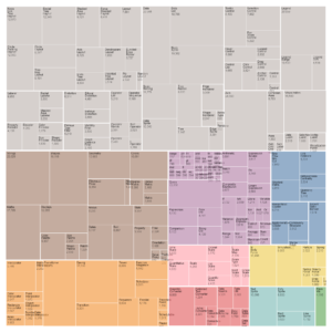
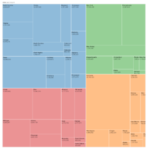
A bubble chart is a type of data visualization that displays data points as bubbles or circles on a two-dimensional graph. Each bubble represents a single data point, with the position of the bubble determined by its coordinates on the x and y axes, and its size proportional to a third variable. This third variable can represent numerical data such as population size, revenue, or any other relevant metric. Bubble charts are effective for visualizing relationships between three variables simultaneously, allowing for the identification of trends, patterns, and correlations within the data. They are commonly used in fields such as economics, finance, and market research for exploratory data analysis and presentation of complex datasets.

Purpose :

The purposes of a bubble chart include:

  1. Visualizing Multivariate Data: Bubble charts allow for the visualization of three variables simultaneously by representing data points as bubbles on a two-dimensional plane, with the size and color of the bubbles indicating additional dimensions.
  2. Comparing Data Points: Bubble charts facilitate comparison between data points by encoding multiple variables, such as value, size, and color, into the representation of each bubble.
  3. Highlighting Patterns and Trends: They help in identifying patterns and trends within the data by visually examining the distribution, size, and color of the bubbles, enabling users to detect correlations or outliers.
  4. Exploring Relationships: Bubble charts enable exploration of relationships between variables by visually inspecting how the position, size, and color of bubbles change in response to changes in the underlying data.
  5. Identifying Outliers: Bubble charts assist in identifying outliers or unusual data points by visually comparing the size and position of bubbles relative to the overall distribution.
  6. Communicating Insights: They serve as effective communication tools for presenting insights from data analysis to stakeholders or audiences in a clear, concise, and visually appealing manner.
  7. Storytelling and Narrative: Bubble charts can be used to tell stories or narratives about the data by highlighting specific data points or trends using size, color, and positioning of bubbles.
  8. Supporting Decision-Making: Bubble charts aid in decision-making processes by providing a visual representation of complex data sets, allowing stakeholders to make informed decisions based on insights gained from the visualization.
  9. Exploratory Data Analysis: They facilitate exploratory data analysis by providing a visual overview of the data, allowing users to identify interesting patterns or relationships that may warrant further investigation.
  10. Providing Context: Bubble charts offer context to numerical data by representing it in a visual form, making it easier for users to understand and interpret the data in relation to its multivariate dimensions.

Uses :

Here are some common uses of a bubble chart:

  1. Visualizing Multivariate Data: Bubble charts allow for the visualization of three variables simultaneously by representing data points as bubbles on a two-dimensional plane, with the size and color of the bubbles indicating additional dimensions.
  2. Comparing Data Points: Bubble charts facilitate comparison between data points by encoding multiple variables, such as value, size, and color, into the representation of each bubble.
  3. Highlighting Patterns and Trends: They help in identifying patterns and trends within the data by visually examining the distribution, size, and color of the bubbles, enabling users to detect correlations or outliers.
  4. Exploring Relationships: Bubble charts enable exploration of relationships between variables by visually inspecting how the position, size, and color of bubbles change in response to changes in the underlying data.
  5. Identifying Outliers: Bubble charts assist in identifying outliers or unusual data points by visually comparing the size and position of bubbles relative to the overall distribution.
  6. Communicating Insights: They serve as effective communication tools for presenting insights from data analysis to stakeholders or audiences in a clear, concise, and visually appealing manner.
  7. Storytelling and Narrative: Bubble charts can be used to tell stories or narratives about the data by highlighting specific data points or trends using size, color, and positioning of bubbles.
  8. Supporting Decision-Making: Bubble charts aid in decision-making processes by providing a visual representation of complex data sets, allowing stakeholders to make informed decisions based on insights gained from the visualization.
  9. Exploratory Data Analysis: They facilitate exploratory data analysis by providing a visual overview of the data, allowing users to identify interesting patterns or relationships that may warrant further investigation.
  10. Providing Context: Bubble charts offer context to numerical data by representing it in a visual form, making it easier for users to understand and interpret the data in relation to its multivariate dimensions.

Reviews

There are no reviews yet.

Only logged in customers who have purchased this product may leave a review.