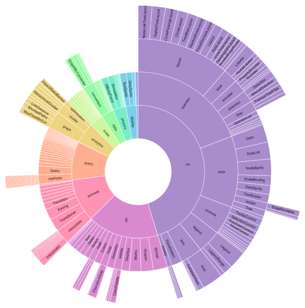
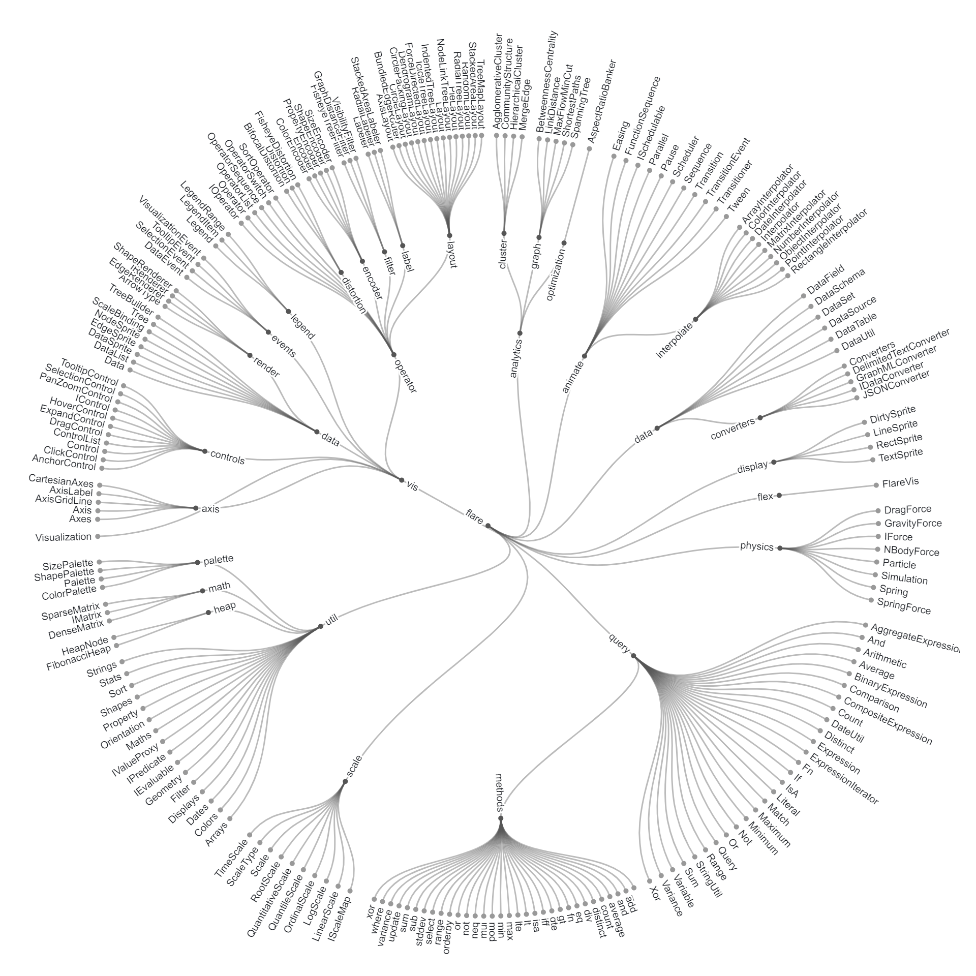
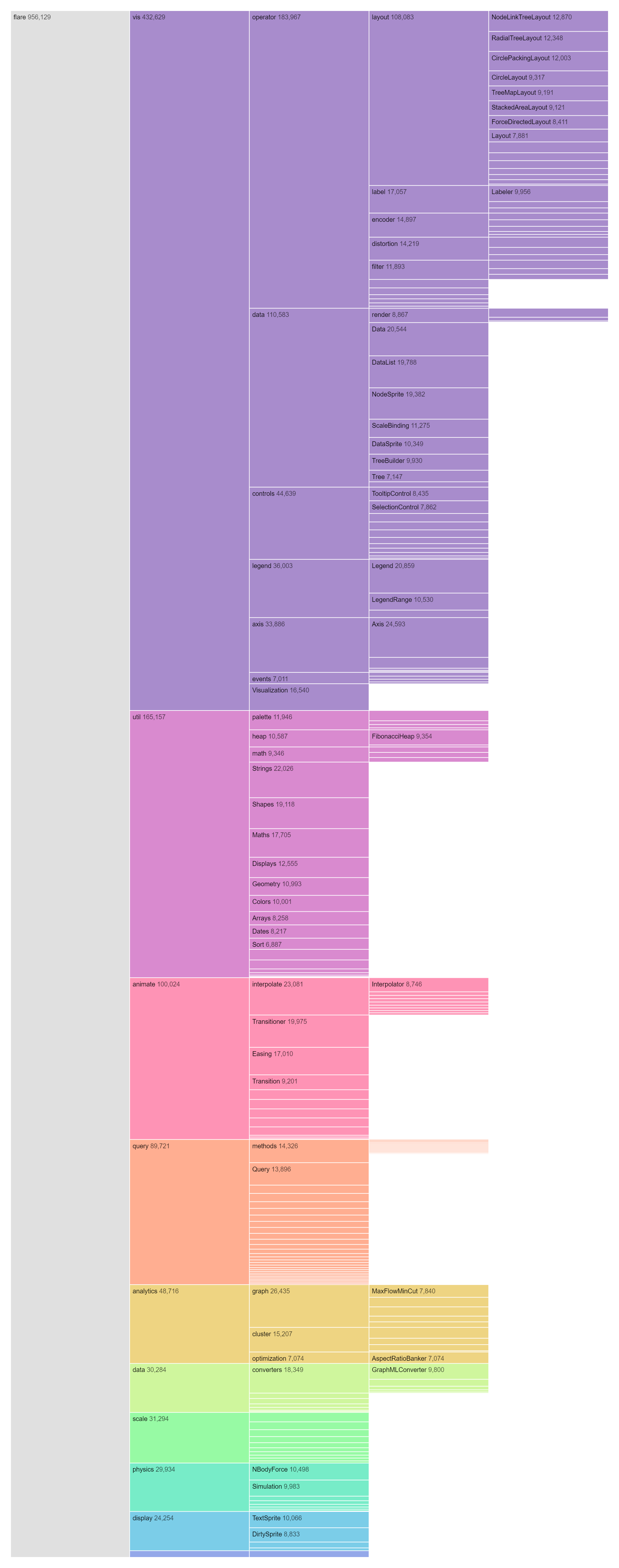
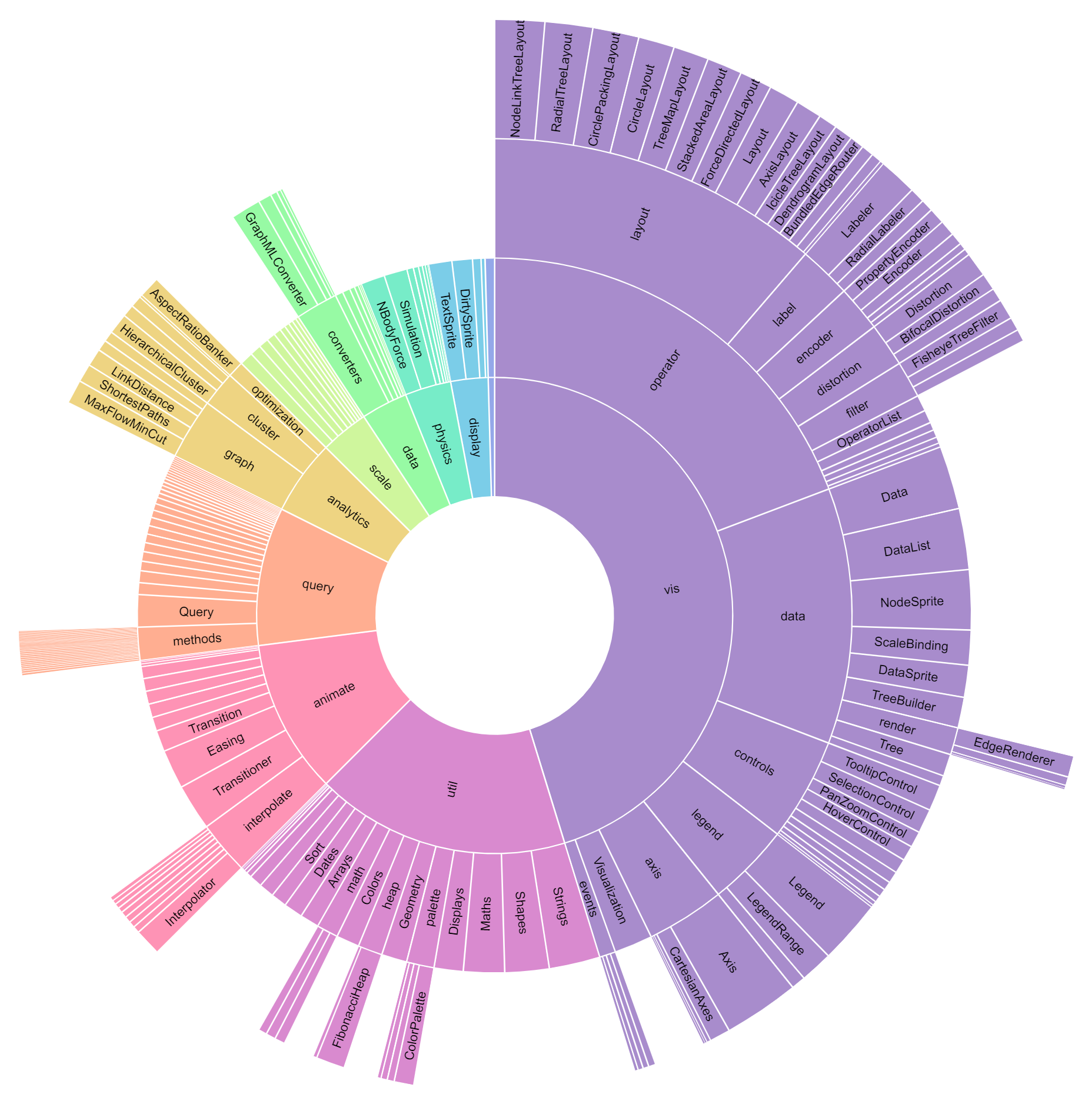
The Sunburst Chart is a captivating hierarchical data visualization tool that presents hierarchical relationships in a circular layout, resembling the layers of an onion or the rays of the sun. Each level of the hierarchy is represented by concentric rings, with the outermost ring depicting the top-level categories or groups, and subsequent rings representing sub-categories or sub-groups nested within them. Each segment within a ring represents a data point or entity, with the size of the segment proportional to a quantitative value associated with it. The hierarchical relationships between segments are depicted by their nesting within rings, with parent segments positioned closer to the center and child segments placed further away. Additionally, the Sunburst Chart utilizes color coding to differentiate between categories or groups, enhancing readability and comprehension. This radial layout offers a visually intuitive representation of complex hierarchical structures, enabling users to explore and analyze data in an engaging and interactive manner.
Uses:
- Disk Space Allocation: Visualizing the distribution of disk space usage across directories and files in a hierarchical file system.
- Website Traffic Analysis: Analyzing website traffic patterns by visualizing the distribution of visits across different pages, sections, and categories.
- Nutritional Analysis: Representing the nutritional composition of foods by visualizing their macro and micronutrient content in hierarchical categories.
- Portfolio Allocation: Visualizing portfolio diversification and asset allocation in finance by representing investments across asset classes, sectors, and industries.
- Ecosystem Analysis: Mapping ecological networks and species interactions in ecology research to understand biodiversity and ecosystem dynamics.
- Organizational Efficiency: Analyzing organizational efficiency and resource allocation by visualizing project budgets, expenditures, and resource distribution.
- Supply Chain Management: Visualizing supply chain networks and logistics by representing suppliers, manufacturers, distributors, and retailers.
- Hierarchical Task Management: Managing and tracking tasks and projects by visualizing their hierarchical relationships and dependencies.
- Sales Performance Analysis: Analyzing sales performance by visualizing revenue contributions across products, regions, and customer segments.
- Product Development: Managing and tracking product development processes by visualizing feature priorities, development stages, and dependencies.
Purposes:
- Holistic Overview: Providing a holistic overview of hierarchical data structures and relationships, allowing users to grasp the entire dataset at a glance.
- Pattern Recognition: Facilitating the identification of patterns, trends, and anomalies within hierarchical datasets, aiding in data analysis and insight generation.
- Interactive Exploration: Enabling interactive exploration and navigation of hierarchical datasets, allowing users to zoom in, zoom out, and interact with individual segments.
- Comparative Analysis: Supporting comparative analysis of different hierarchical structures or datasets, allowing users to compare patterns, distributions, and relationships.
- Spatial Representation: Representing spatial relationships and distributions in a circular format, offering a unique perspective on geographical, biological, or network data.
- Communication Aid: Serving as a visual communication aid for presenting complex hierarchical data to stakeholders, clients, or colleagues, enhancing understanding and decision-making.
- Dynamic Visualization: Creating dynamic and interactive visualizations that respond to user inputs and interactions, providing a customizable and engaging user experience.
- Knowledge Discovery: Facilitating knowledge discovery by revealing insights, relationships, or clusters within complex hierarchical datasets through visual exploration and analysis.
- Storytelling Tool: Using radial layouts to create engaging and interactive storytelling experiences, presenting narratives, timelines, and historical events in a visually compelling format.
- Creative Expression: Allowing for creative expression and artistic visualization of hierarchical data, combining aesthetics with functionality to create visually appealing and informative charts.
Reviews
There are no reviews yet.