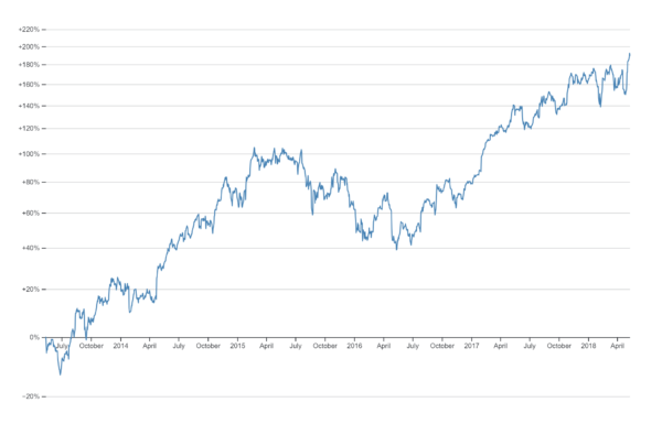
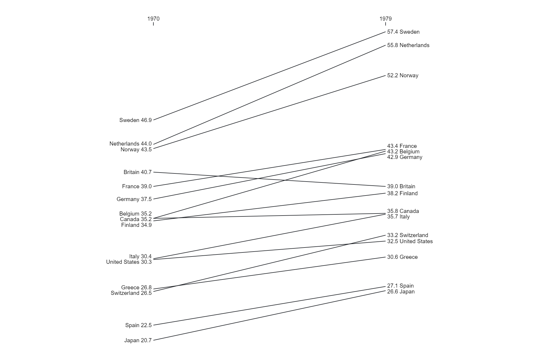
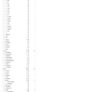
A change line chart is a type of data visualization that illustrates the difference or change in values between two points in time or categories. It typically plots the change as a line graph, with the x-axis representing the time periods or categories being compared, and the y-axis representing the magnitude of the change. These charts provide a clear and concise way to visualize shifts or trends in data over time, making it easier to identify patterns, anomalies, or areas of improvement.
Purposes :
The purposes of a change line chart include:
Visualizing Trends: Change line charts are effective for visualizing trends in data over time or across different categories. They provide a clear representation of how values have changed between two points in time or categories.
Identifying Patterns: These charts help identify patterns or trends in data by highlighting the magnitude and direction of change between two points. Users can easily spot increases, decreases, or fluctuations in values.
Comparing Changes: Change line charts enable users to compare changes in values between different time periods, categories, or groups. They provide a visual indication of which variables have experienced the most significant shifts.
Highlighting Anomalies: Change line charts can help identify anomalies or outliers in data by visualizing unexpected changes between two points. Users can quickly spot deviations from expected patterns or trends.
Assessing Performance: These charts are useful for assessing performance metrics by visualizing changes in key indicators over time. They allow users to track progress towards goals or targets and identify areas for improvement.
Communicating Insights: Change line charts provide a clear and concise way to communicate insights and findings to stakeholders, decision-makers, and the general audience. They help convey changes in data in an easily understandable format.
Supporting Decision-Making: By visualizing changes in key variables, change line charts support decision-making processes by providing stakeholders with actionable insights. They inform strategic planning, resource allocation, and policy decisions by highlighting areas of concern or success.
Overall, change line charts serve as valuable tools for analyzing trends, identifying patterns, comparing changes, communicating insights, supporting decision-making, and monitoring performance in various domains.
Uses :
The uses of a change line chart include:
Visualizing Trends: Change line charts help visualize trends by displaying changes in values between two points in time or categories. They provide a clear representation of how variables have evolved over time.
Comparing Changes: These charts enable users to compare changes in values between different time periods, categories, or groups. They facilitate the identification of which variables have experienced significant shifts and the magnitude of those changes.
Identifying Patterns: Change line charts assist in identifying patterns or trends in data by highlighting the magnitude and direction of change between two points. Users can easily spot increases, decreases, or fluctuations in values.
Monitoring Performance: Change line charts are useful for monitoring performance metrics by visualizing changes in key indicators over time. They allow users to track progress towards goals or targets and identify areas for improvement.
Highlighting Anomalies: These charts help identify anomalies or outliers in data by visualizing unexpected changes between two points. Users can quickly spot deviations from expected patterns or trends.
Communicating Insights: Change line charts provide a clear and concise way to communicate insights and findings to stakeholders, decision-makers, and the general audience. They help convey changes in data in an easily understandable format.
Supporting Decision-Making: By visualizing changes in key variables, change line charts support decision-making processes by providing stakeholders with actionable insights. They inform strategic planning, resource allocation, and policy decisions by highlighting areas of concern or success.
Overall, change line charts serve as valuable tools for analyzing trends, identifying patterns, comparing changes, communicating insights, supporting decision-making, and monitoring performance in various domains.
Reviews
There are no reviews yet.
Only logged in customers who have purchased this product may leave a review.


Reviews
There are no reviews yet.