Description
Description :
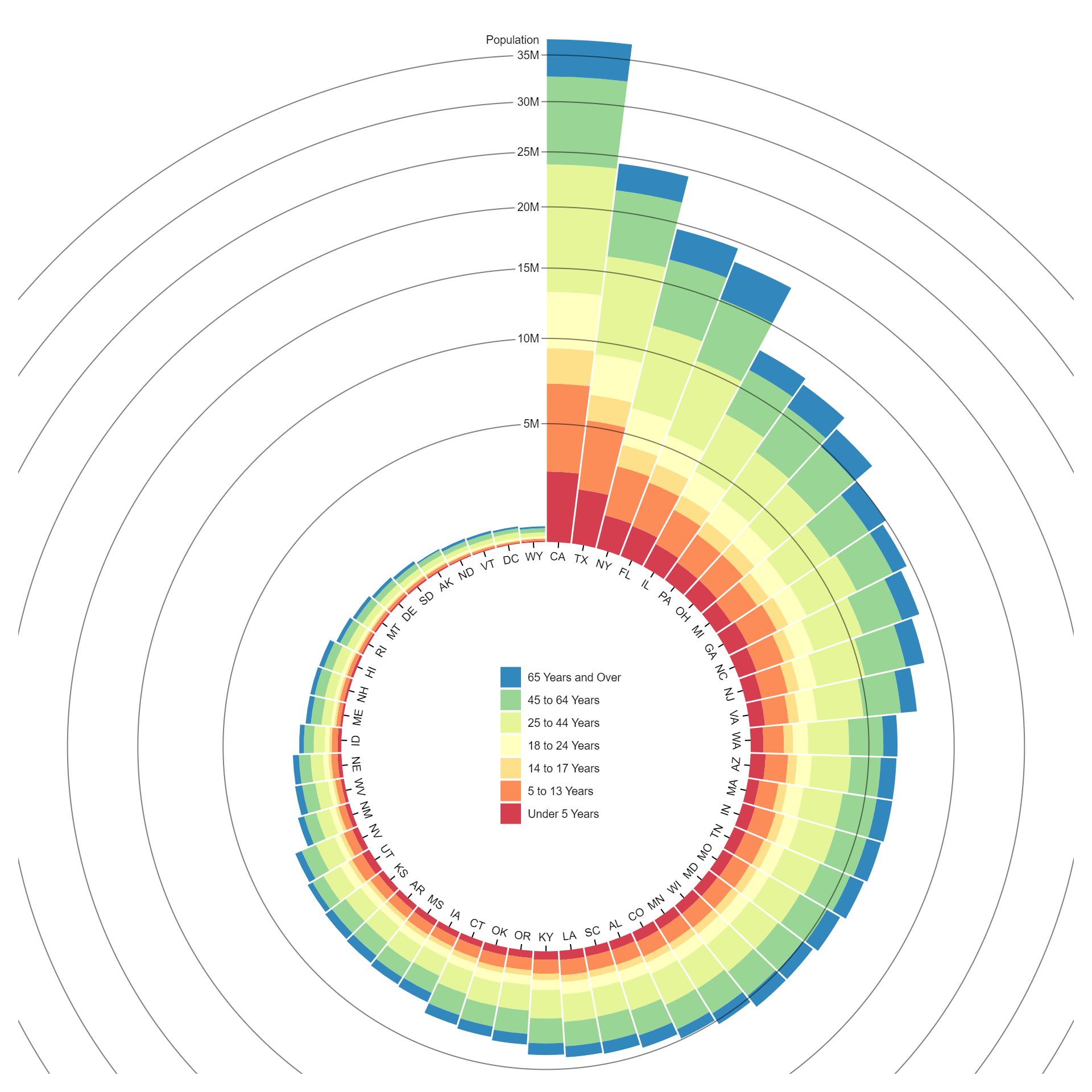
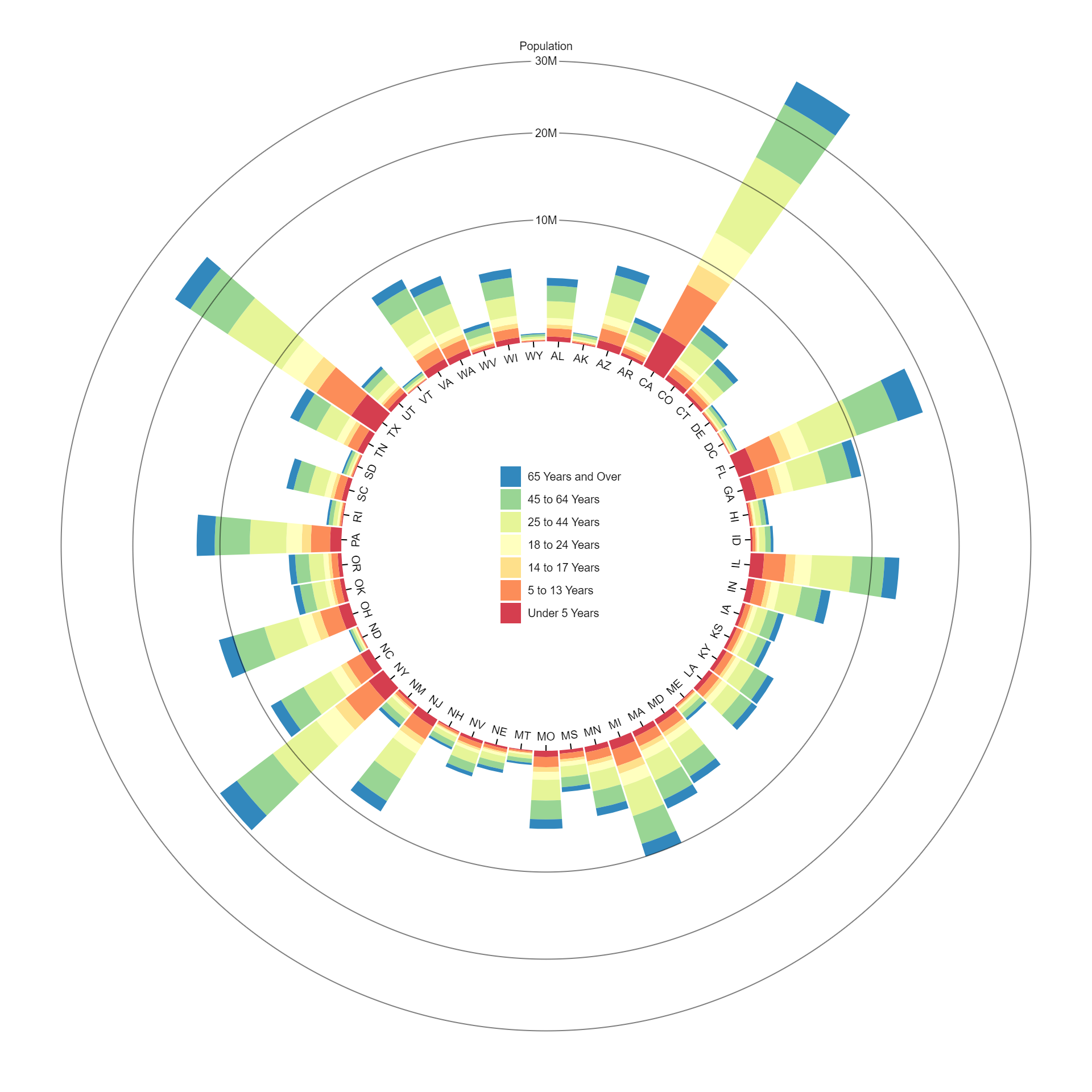
A radial stacked bar chart is a circular data visualization that represents categorical data using stacked bars arranged radially around a central point. Each bar segment represents a category, with the length of the segment indicating the value of that category. The bars are stacked on top of each other, with the height of each stack representing the total value for a specific group or data series. This type of chart is useful for visualizing hierarchical or nested data structures and comparing the composition of different categories within each group or data series.
Purpose :
The purpose of a radial stacked bar chart includes:
- Hierarchical Visualization: Radial stacked bar charts are used to visualize hierarchical or nested data structures where categories are organized into groups. This allows users to understand the composition of each group and the relative contributions of different categories within it.
- Comparative Analysis: These charts facilitate comparative analysis by visually comparing the distribution of values across categories within each group. Users can easily identify differences in the composition of data between groups and spot patterns or trends.
- Pattern Recognition: Radial stacked bar charts help in recognizing patterns or trends within the data. By observing the distribution of values around the central point, users can identify which categories are predominant or have higher values, aiding in trend analysis.
- Summarizing Data: These charts provide a concise summary of data by representing multiple categories and groups in a single visualization. Users can quickly grasp the overall composition and relative proportions of different categories within each group.
- Communication of Insights: Radial stacked bar charts serve as effective communication tools for presenting insights and findings to stakeholders. The visual representation of data makes it easier for viewers to understand complex relationships and make informed decisions based on the insights gained.
- Visual Impact: Radial stacked bar charts have a visually appealing layout that can capture the attention of viewers and convey information in a clear and intuitive manner. This makes them useful for presentations, reports, and dashboards where visual impact is important.
Overall, the purpose of a radial stacked bar chart is to provide a visually intuitive way to visualize hierarchical data structures, compare data distributions, recognize patterns, summarize data, communicate insights, and create visually impactful presentations.
The uses of a stacked bar chart include:
- Comparative Analysis: Stacked bar charts are used to compare the composition of different categories or groups within a dataset. By stacking the bars, users can easily visualize the total value and the contribution of each category to the whole.
- Trend Analysis: Stacked bar charts help in analyzing trends over time or across different segments. Users can observe changes in the distribution of values within each category over multiple periods or segments.
- Part-to-Whole Relationships: Stacked bar charts are effective in showing part-to-whole relationships. They illustrate how each category contributes to the total value, allowing viewers to understand the relative proportions of different components.
- Hierarchical Visualization: Stacked bar charts can represent hierarchical or nested data structures. Each bar segment can represent a subcategory within a larger category, enabling users to visualize the hierarchy and relationships between different levels of data.
- Comparison Across Groups: Stacked bar charts enable comparison of the composition of data across different groups or segments. Users can easily compare the distribution of values within each category across multiple groups, helping to identify similarities and differences.
- Summarizing Data: Stacked bar charts provide a concise summary of data by visually representing multiple categories or groups in a single chart. They condense complex information into a simple and easy-to-understand format.
- Data Presentation: Stacked bar charts are commonly used for presenting data in reports, presentations, and dashboards. They provide a visually appealing and intuitive way to convey information, making them suitable for communicating insights to stakeholders.
Overall, stacked bar charts are versatile visualization tools that are widely used for comparative analysis, trend analysis, part-to-whole relationships, hierarchical visualization, comparison across groups, summarizing data, and data presentation in various domains and applications.
Only logged in customers who have purchased this product may leave a review.
Related products
-
- Sale!
Circle Packing
-
$ 15Original price was: $ 15.$ 10Current price is: $ 10. - Add to cart
-
- Sale!
Moving Average Chart
-
$ 15Original price was: $ 15.$ 10Current price is: $ 10. - Add to cart
-
- Sale!
Tidy Tree
-
$ 15Original price was: $ 15.$ 10Current price is: $ 10. - Add to cart

Reviews
There are no reviews yet.